As avid wool enthusiasts (including a few shepherds) most of us are all too well aware that the cost of shearing a flock of sheep is rarely ever covered by the sale of the fleece. In fact the financial return on many fleeces is so poor, I know many farmers end up composting what should be a valuable and eco-friendly product.
Part of the problem is that many of these under-valued fleeces are typically at the coarser end of the spectrum, shorn from sheep bred for the meat industry. In some cases the situation is further compounded by farmers deliberately selecting sheep with coarser wools for their breeding program because their logic dictates, coarser wool = a heavier fleece per sheep and since wool is sold by weight, a heavier fleece = more $$$.
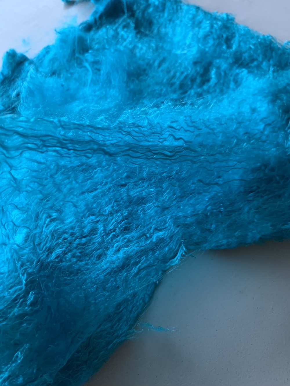
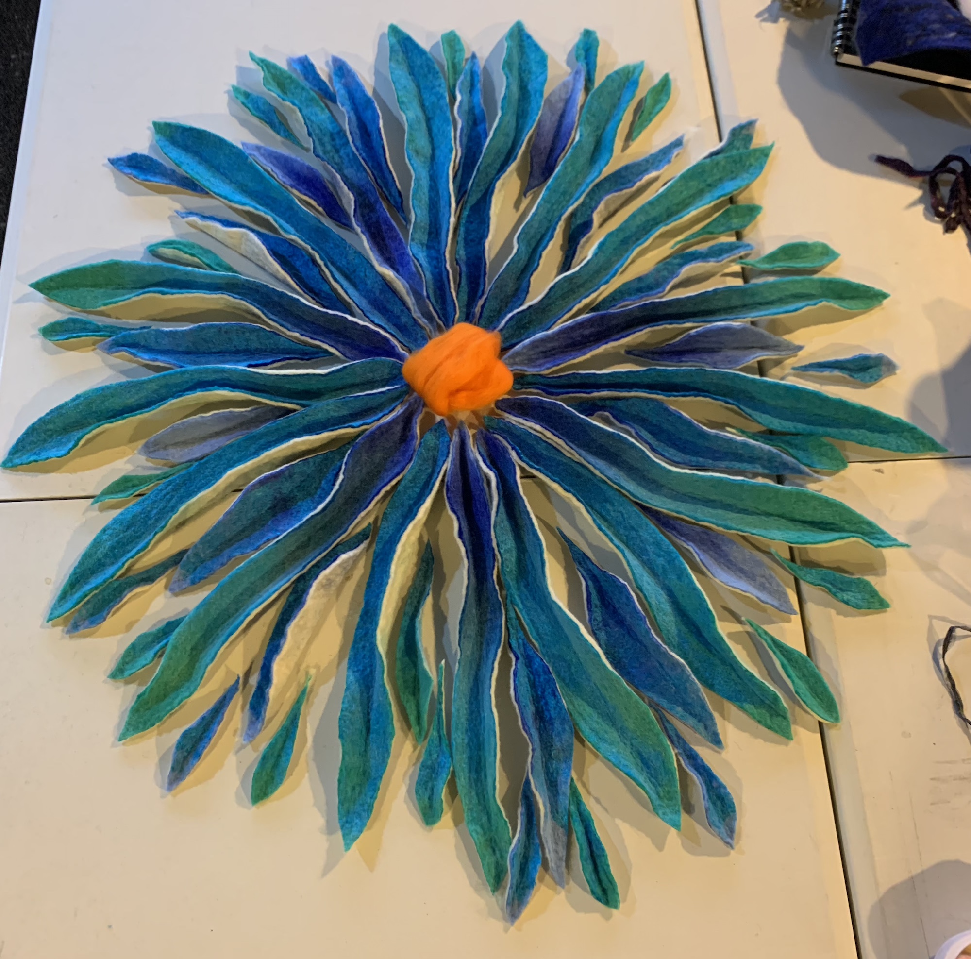
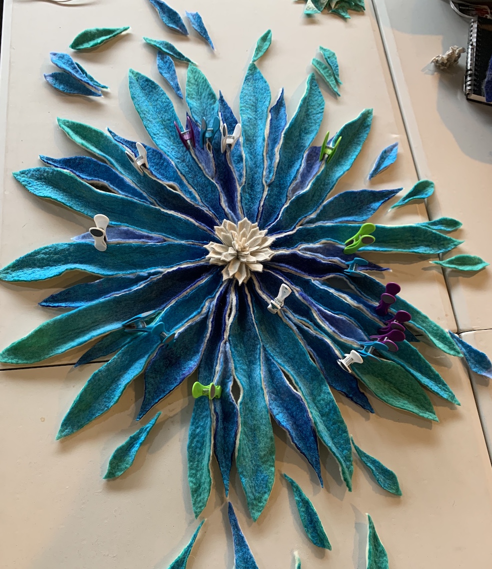
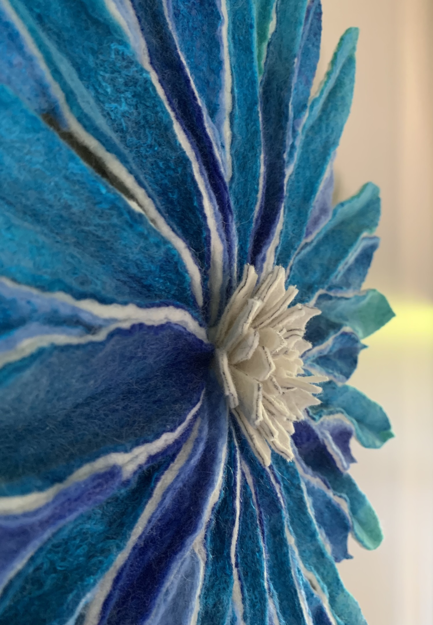
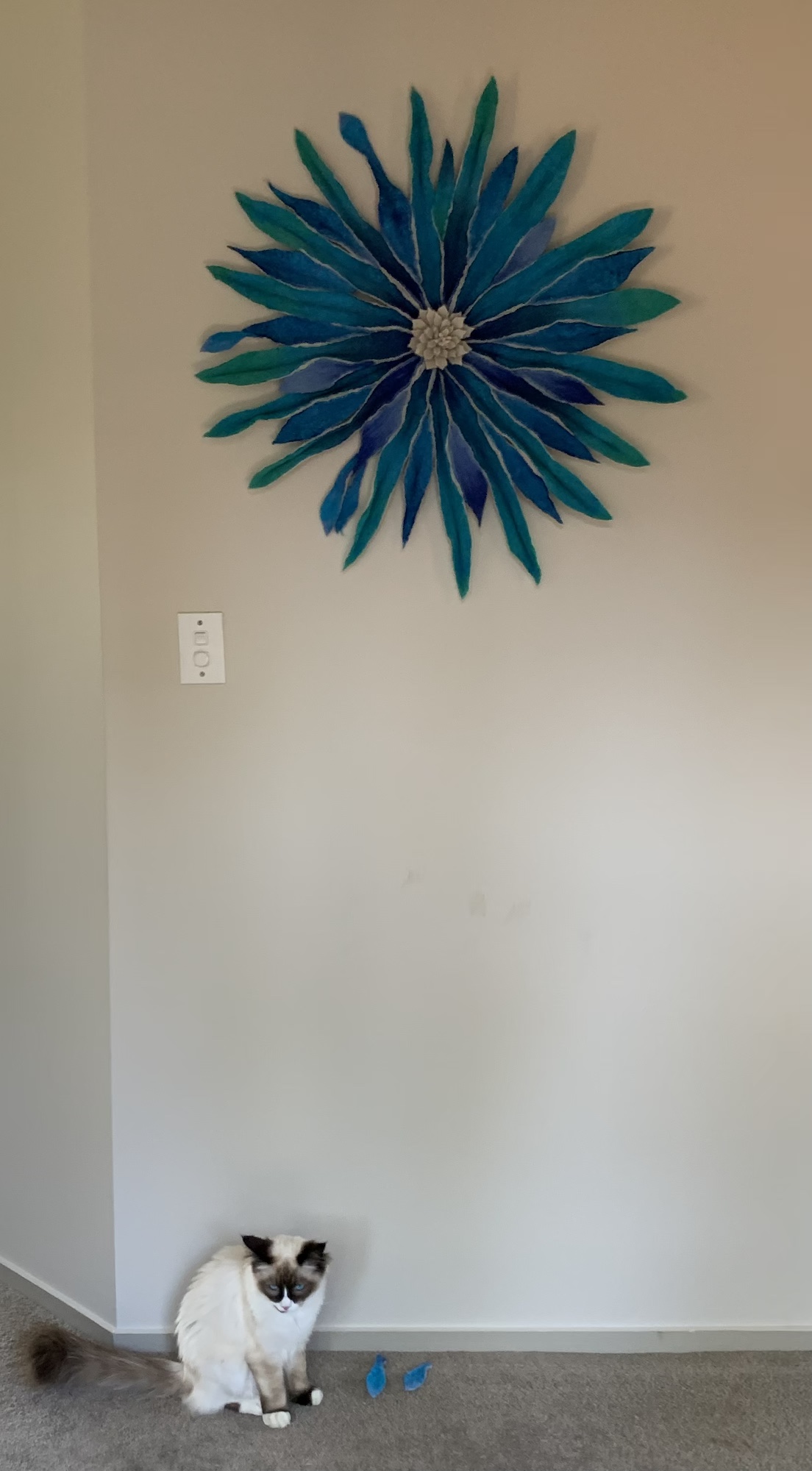
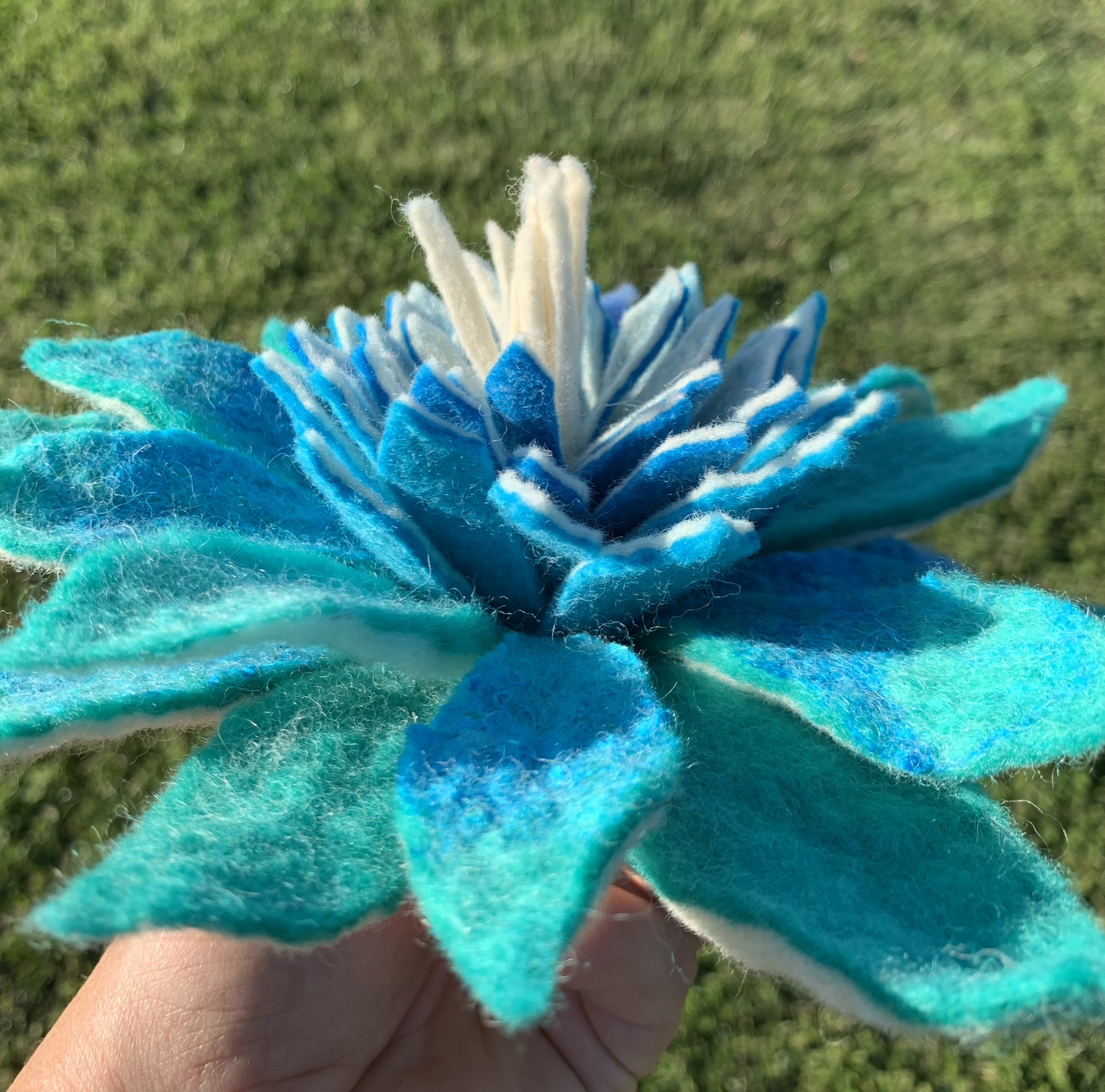
If, like me you make mostly wearables from wool, you probably see the fault in that logic, I know I value the lower micron wools far more, cheerfully paying a premium for them because they are less “scratchy”. However, this doesn’t mean there isn’t a place for the coarser wools too and as felt-makers and spinners perhaps we should not be so quick to dismiss them….
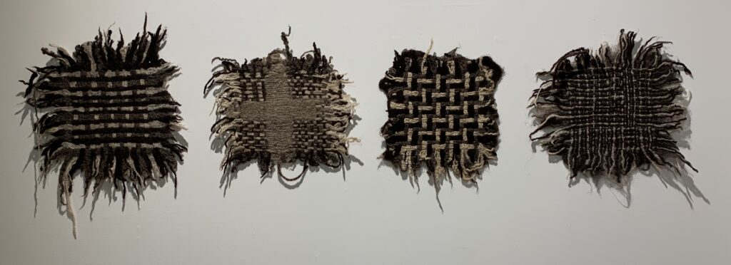
These coarser wools, also known as “strong wool”, have traditionally been used for various industrial applications that require padding that is fire resistant, for home insulation products, even the pads that piano hammers rest on.
In previous decades, one of the largest buyers of strong wools used to be the carpet industry, unfortunately the move towards synthetic carpets has seen the use of strong wools for carpets go into a steep decline. Currently there is a drive in New Zealand to support rural schools to replace their flooring with wool carpets, rather than the imported nylon carpet tiles the government wants them to use.
I fist met Liz Mitchell MNZM when she joined the Auckland Fun Felters (AFF), just a month or two after I did. Already a wool enthusiast, she was on a mission to discover new ways to use this fabulous, natural material and her enthusiastic interest quickly evolved into a dedicated promotion of strong wool.
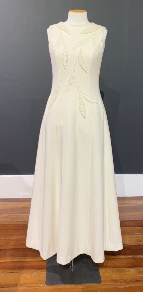
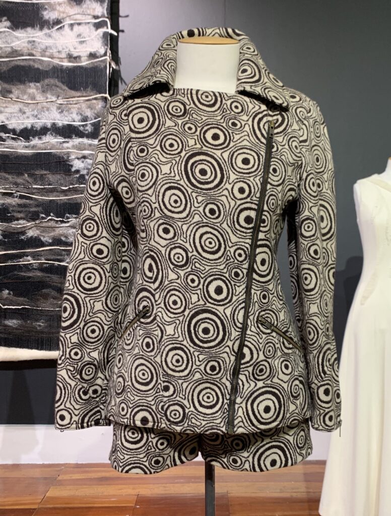
Liz has had a very interesting textile career, as a fashion designer, with her own label, she was primarily focussed on hand-made couture and in 2005 was awarded the New Zealand Order of Merit for services to the fashion industry and to this day she is one of the best known names in New Zealand fashion.
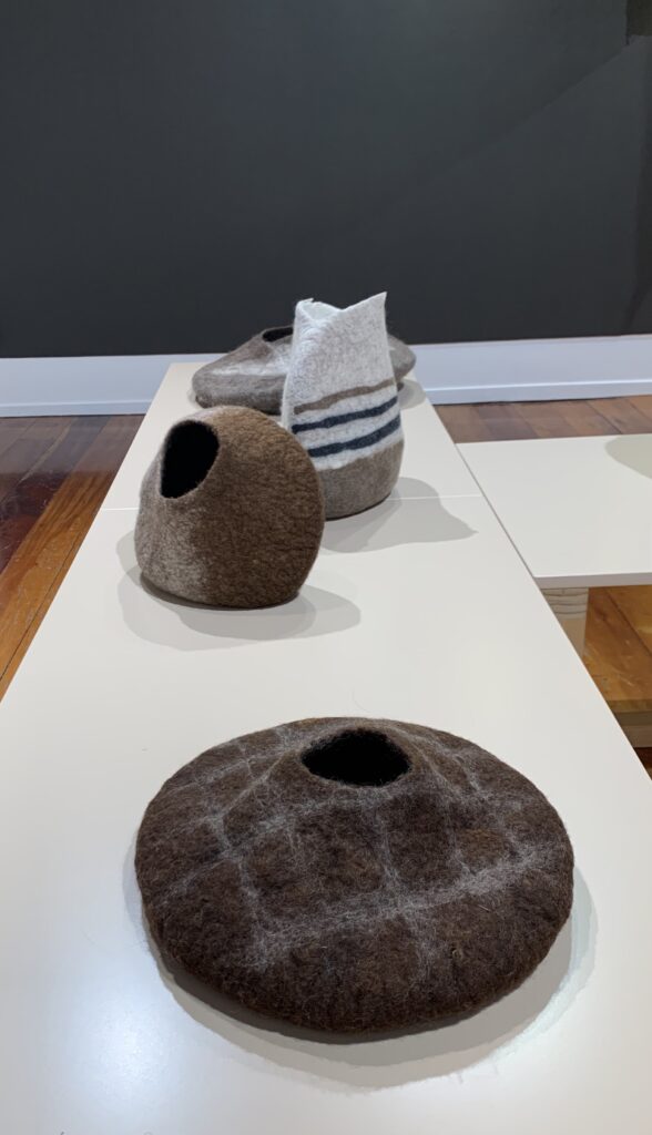
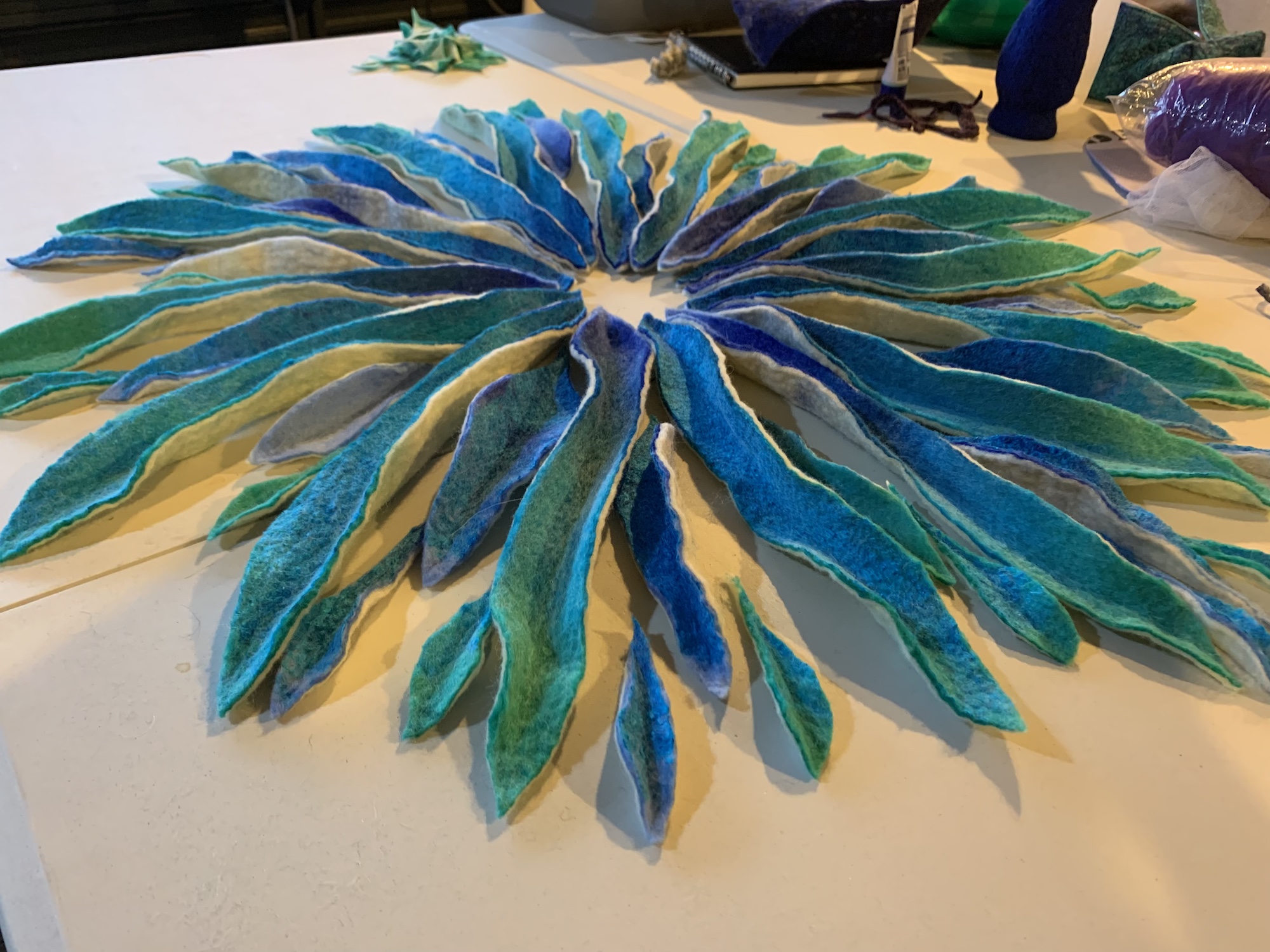
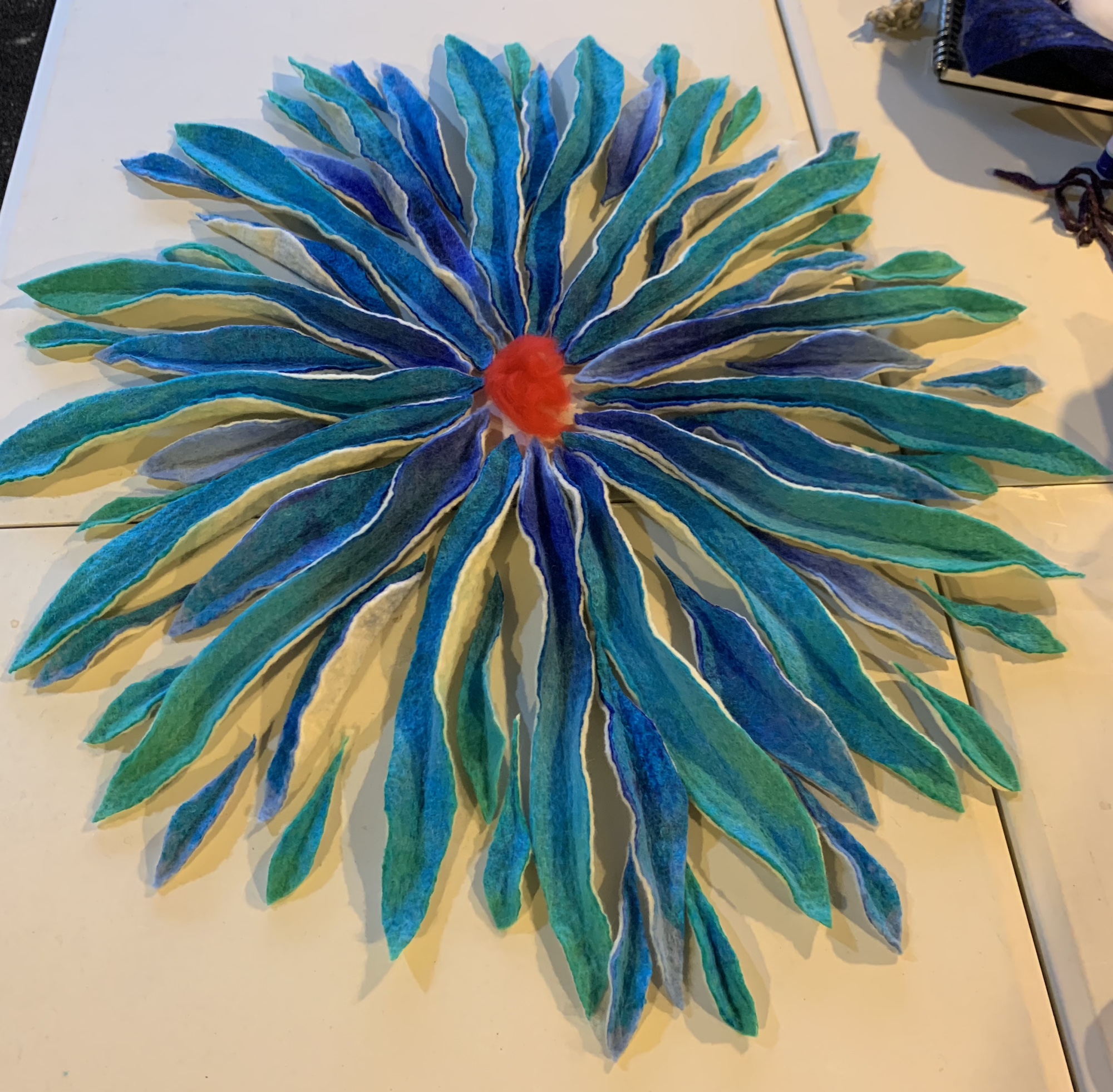
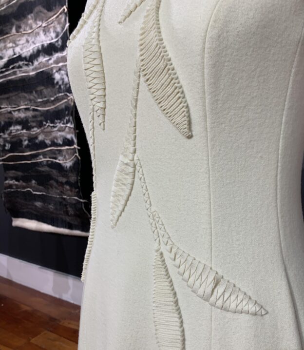
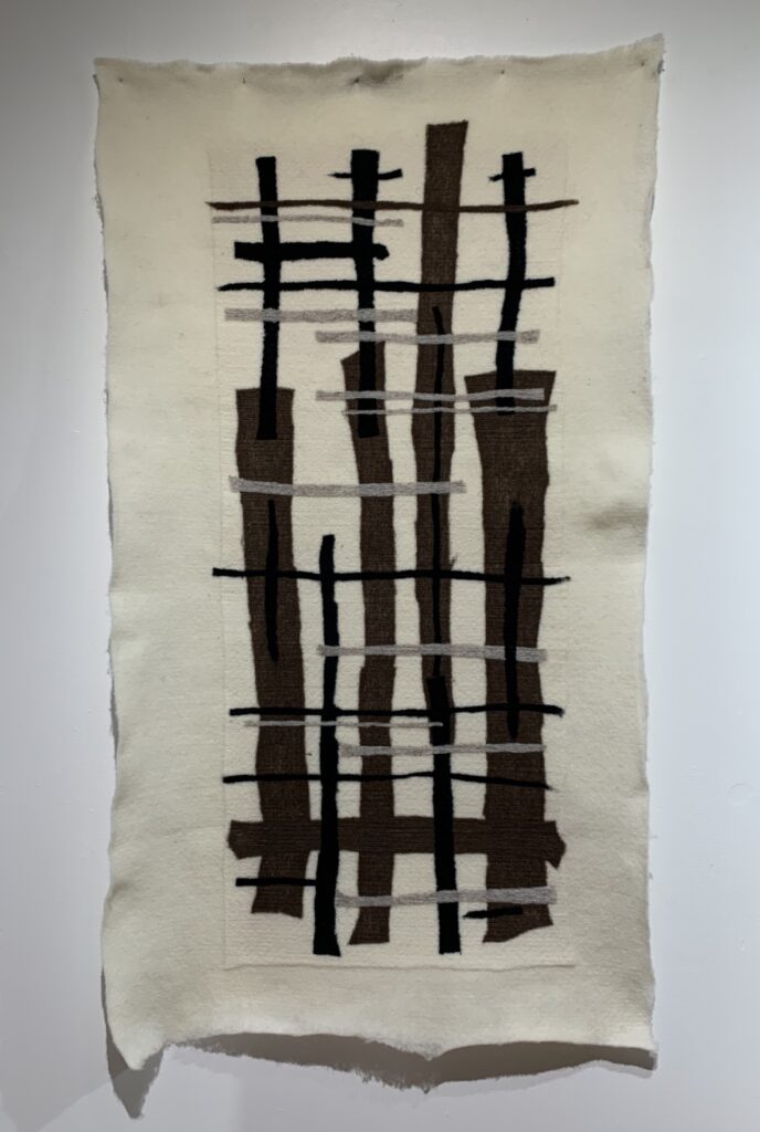
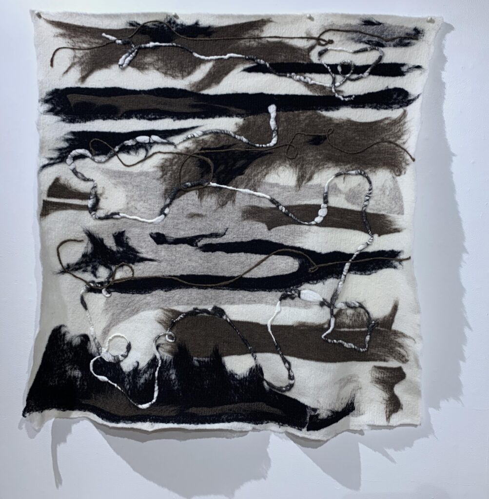
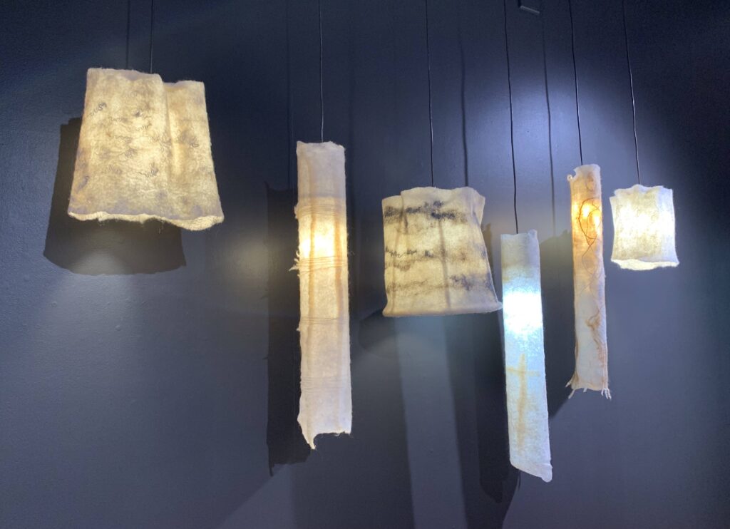
In recent years Liz has expanded her repertoire to include working with architects and interior designers to use strong wools, still in their natural colours, for a mixture of wall hangings, rugs and soft furnishings. Her diversification from haute couture to interior design is beautifully documented in her current exhibition, “This Raw Material” on show at the Corban Estate Arts Centre in West Auckland.
This exhibition is open until 9 December 2023 and is well worth a visit, I particularly enjoyed the interactive room where you are encouraged to touch, feel, sit on and even smell the pieces. When was the last time you went an art exhibition where they encouraged you to sniff the exhibits?!! 🙂
We were all very proud to hear Liz has secured a grant to set up a “Wool and Natural Fibres Textile Hub” in Auckland, which will serve as a hub for wool research, education and creative exploration. An endeavour I am very keen to support. She has also set up a Wool Revolution PledgeMe to raise funds to support the new Hub.