I confess, I am not really one for writing book reviews, it is rare that a book excites me enough to give it a star rating on Amazon but this one is in a class of its own….
Following a very enjoyable workshop with Mark Cazalet a few weeks ago I was looking to broaden my pastel drawing skills so trotted off to my local library to see what they had, the front cover of the book immediately grabbed my attention and flicking through the vibrantly colourful photos in the book had me hooked.

The title, Pastel Innovations, 60+ techniques and exercises for painting with pastels is a little misleading because this is really a mixed media book with pastels as a recurring theme, but in my opinion the mixed media element really enhances the book rather than detracts from it.
Dawn starts with a materials list but I like her pragmatic, “use what you already have” approach, she makes a very sensible comment that you are more likely to experiment and take risks when working on cheapo newsprint paper and the art materials you were given as a child but never found a use for. An opportunity to use some 20+ year old materials that I couldn’t bring myself to throw away? I like her already! 🙂
She then takes you on a journey through some basic art theory: line, shape colour etc but she compares each element with her own twist and provides lots of examples and drawings along the way. This section culminates in how to self-critique your work against each of these elements.
At the end of each chapter there are exercises to practice what you have learned, I thought these were the best part of the book and if you learn best by doing, I think they are what sets it apart from so many art theory books.
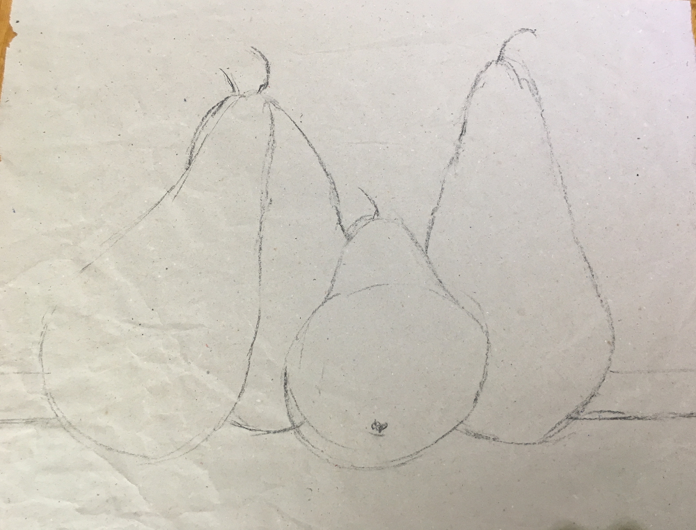
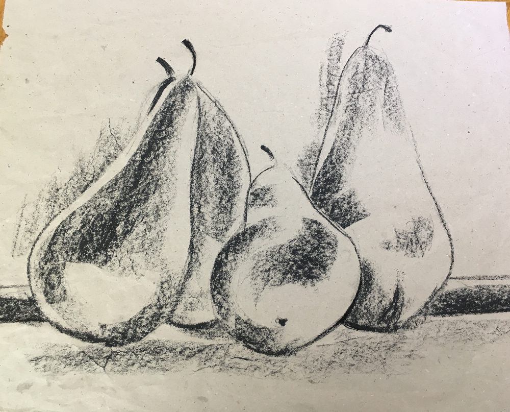
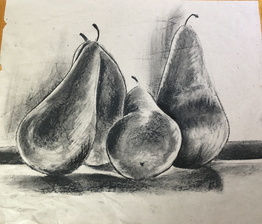
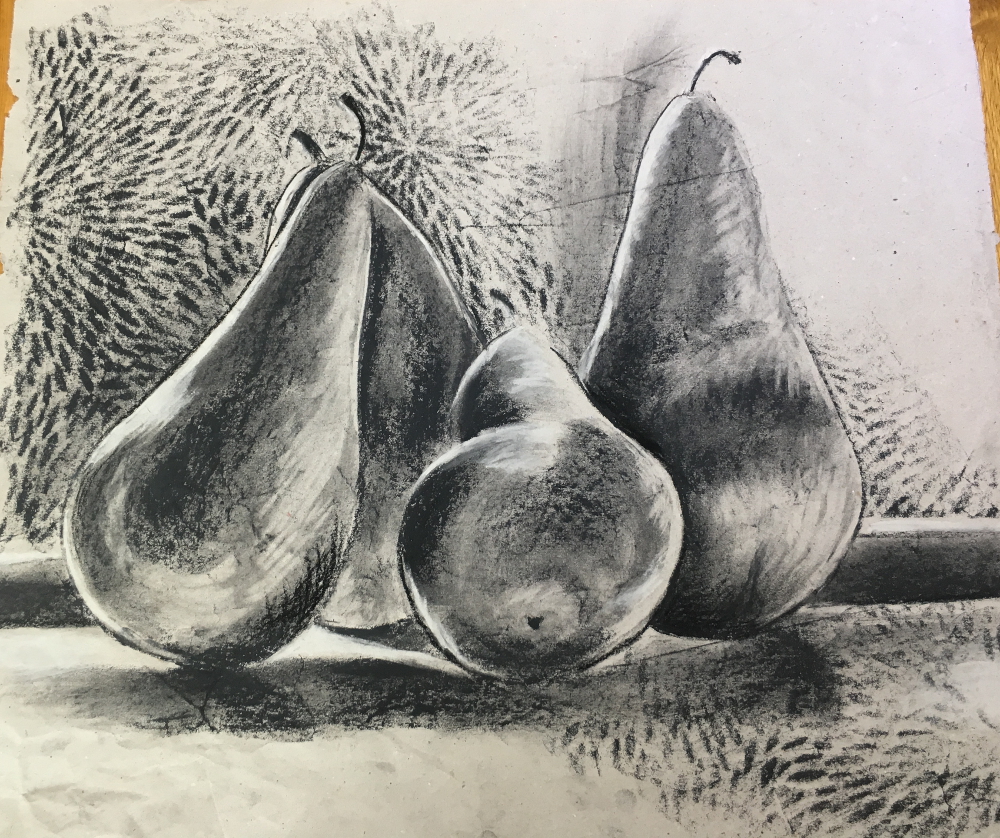
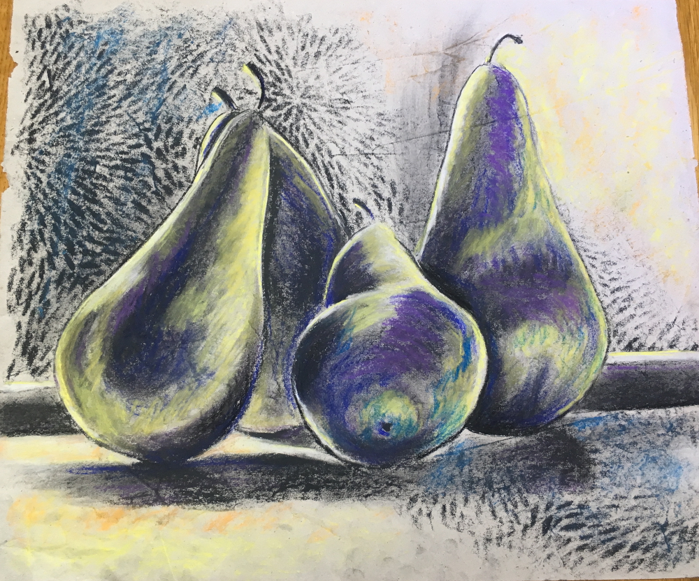
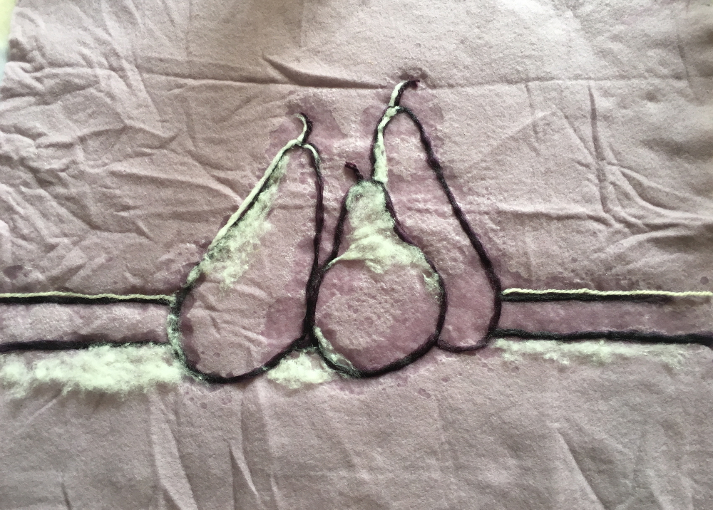
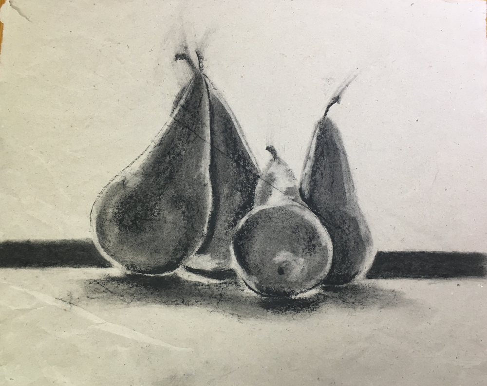
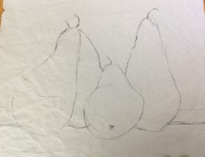
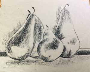
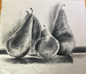
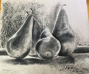
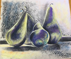
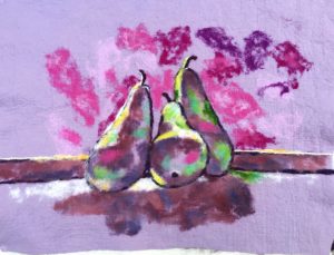
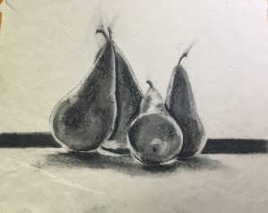
This is my interpretation of the exercises from chapter 1…. Dawn provides a detailed still life photo to work from by I preferred a black and white photo of some pears on a window sill that she provided for an exercise later in the book.
Line:
Shape:
Value:
Texture:
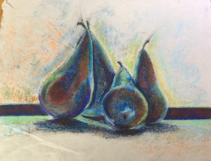
Colour:
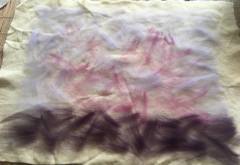
Translating this into textiles…
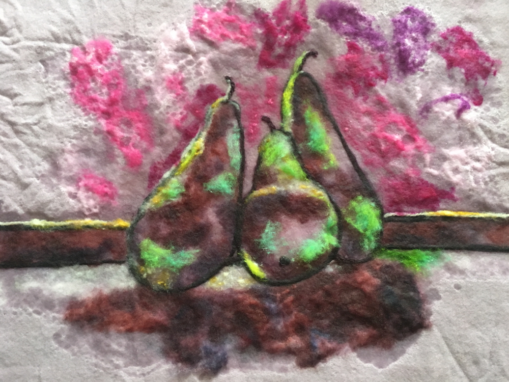
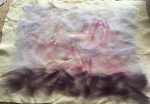
Working with pastels and charcoal is all very lovely but I was itching to put this into practice with felt.
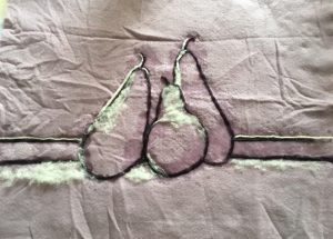
I “cheated” and use some commercial prefelts as a support for my painting with a few wisps of wool between 2 prefelts. Bearing in mind that these fibres will migrate as the felt is fulled I laid out an “underpainting” of tones roughly where I wanted lights and darks to come through between the two layers of prefelt. These fibres will also help the two commercial prefelts glue together
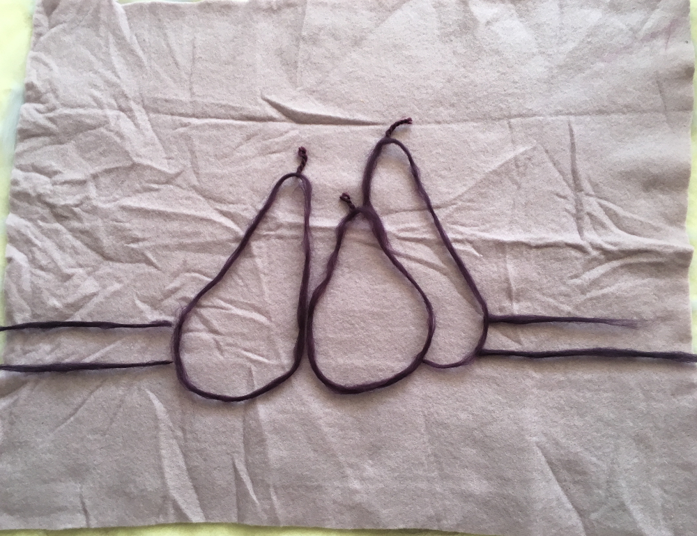
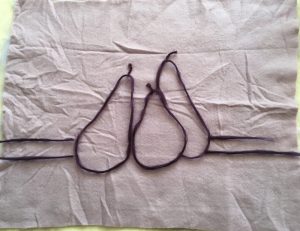
Line
I laid out some purple fibres to suggest the outlines of the pears and windowsill, I used wool tops rolled between my hands with some wool yarns for different line weights and some variety.
Adding white highlights:
Using yarn and Kap merino.
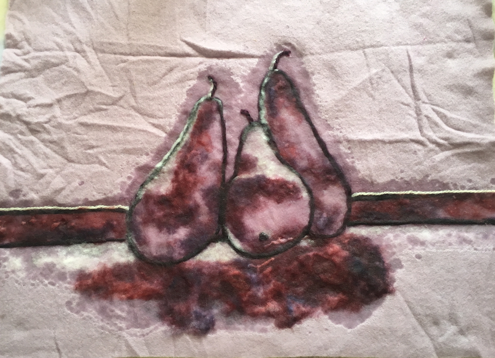
Adding shadows:
I used some low-immersion dyed Kap merino provide some extra depth but you could also blend 2 or 3 different colours / shades to get the same effect.
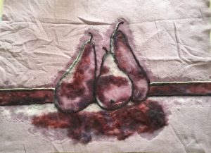
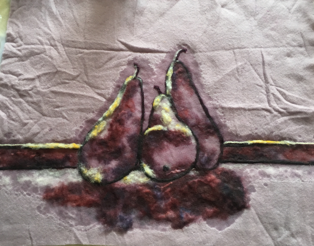
Adding a light complimentary colour
The compliment of purple / mauve is yellow… unfortunately the only yellow I have is quite a dark, orangey yellow, not ideal but blended with some white, it will have to do.
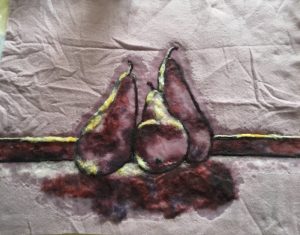
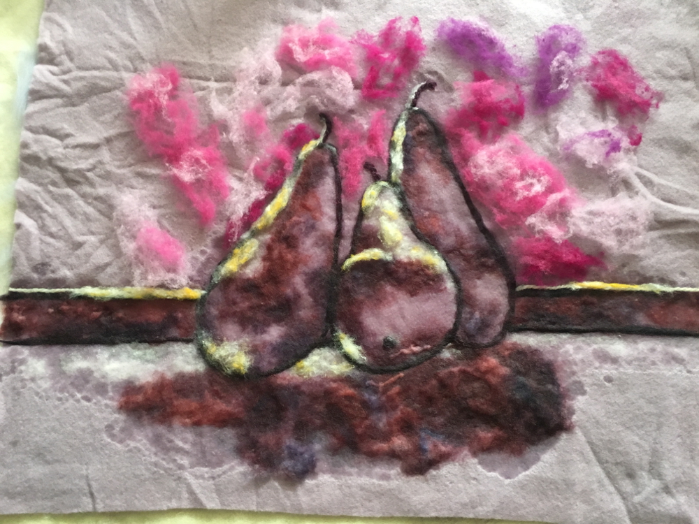
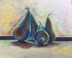
Adding some interest to the background:

Looking at the photo, there’s still something missing….
I think it is green! Green and purple, always a good combination in my mind, and the reddish pinks in the background really throw the greens (their complement) forward, although I am running the risk of ending up with khaki brown once the picture is fulled.

Then I brought touches of the bright pink from the background and used it for mid tone highlights on the pears to try to visually link it all together.
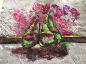
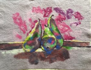
Once it reached the firm prefelt stage (fibres holding together but no shrinkage) I let it dry out so I could assess the colour and needlefelt in some details this is dried prefelt. Wetting the fibres reduces the contrast between the light and dark colours so it is best to let your painting dry out before fulling:
And after adding some more details and dark blue shadows:
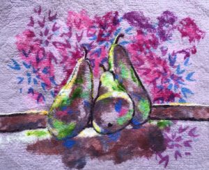
To mimic the texture element from the first exercise I screen-printed some blue and purple patterns over the background and a small area of the foreground before fulling it ready to be stretched over a frame:
My tips for wool paintings:
- Layout your wool directly onto your felting set up, trying to move it once you have starting arranging the fibres could lead to disaster. I like to work on a sheet of plastic over a bamboo mat as the mat gives to wool some extra support, especially in the early stages of felting
- Use only enough soapy water to anchor each layer of fibres down, it it is too wet it will be difficult to place the next layer of fibres where you want them
- Check and rearrange your fibres as necessary every time you add water
- Kap merino is very versatile for wool painting, the short fibres make it very easy to blend and feather the edges of a colour, it is available from Woolknoll in Germany
- Spend at least 10 minutes gently massaging the front of your painting to ensure the surface fibres are knitting together before flipping it over and checking the back is evenly wet before starting to roll.
- Roll up your work, at least to begin with, with the painting facing down, this will minimise the folds and distortion forming in the face (the outside of the roll is slightly stretched while the inside of the roll is slightly compressed when it is rolled up).
Chapter 2 covers various monoprinting, stencilling, embossing and brayer printing techniques, most of which I haven’t tried yet.
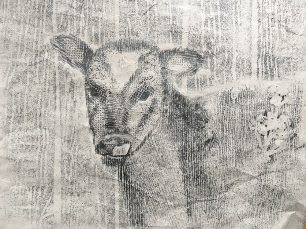
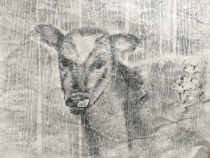
Dawn is clearly a fan of frottage (rubbings), I am sad to say some of the exercises I did for my City and Guilds course put me off this technique but I really like Dawn’s approach. For the most part she seems to use it as an accent in her own work but she also advocated using it to build up an entire image in what she called a “drubbing”. I found this a useful for pushing me away from trying to be to representational and literal in my interpretation and was a lot of fun to boot, this was my attempt at a “drubbing” of a calf using various textured wallpaper samples and charcoal:
Chapter 3 concerns itself with backdrops and under-paintings, among the options presented are, abstracted brayer paintings, watercolour and charcoal value drawings. The exercises at the end of this chapter felt a little disengaged from the chapter content, they predominantly focussed on the effect of different colour combinations but were still very enjoyable and informative in their own right.
Mass drawing with compressed charcoal:
Monochrome:

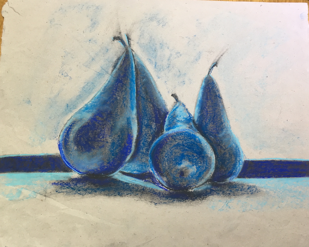
Complementary colours:
Adding analogous colours:
Towards the back of the book there are more mono-printing techniques, how to take a print from a pastel drawing and how to paint with pastels by mixing with a painting medium and using as paint. I confess I simply haven’t had time to work through those exercises yet but am really looking forward to having a play with them.
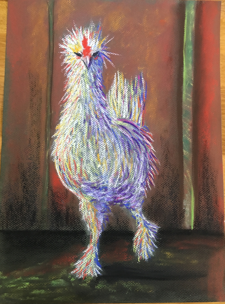
I was particularly smitten with a photo of a fancy chicken that Dawn shared to illustrate the inspiration behind one of her paintings, he was so funny I just couldn’t resist… 🙂

I can see him as a wool painting with his feathers made from coloured yarns and perhaps the occasional wool lock but that will have to wait for a later post….