Category Archives: drawing

Book Review – Pastel Innovations by Dawn Emerson

I confess, I am not really one for writing book reviews, it is rare that a book excites me enough to give it a star rating on Amazon but this one is in a class of its own….

Following a very enjoyable workshop with Mark Cazalet a few weeks ago I was looking to broaden my pastel drawing skills so trotted off to my local library to see what they had, the front cover of the book immediately grabbed my attention and flicking through the vibrantly colourful photos in the book had me hooked.

Return to product information

The title, Pastel Innovations, 60+ techniques and exercises for painting with pastels is a little misleading because this is really a mixed media book with pastels as a recurring theme, but in my opinion the mixed media element really enhances the book rather than detracts from it.

Dawn starts with a materials list but I like her pragmatic, “use what you already have” approach, she makes a very sensible comment that you are more likely to experiment and take risks when working on cheapo newsprint paper and the art materials you were given as a child but never found a use for. An opportunity to use some 20+ year old materials that I couldn’t bring myself to throw away? I like her already! 🙂

She then takes you on a journey through some basic art theory: line, shape colour etc but she compares each element with her own twist and provides lots of examples and drawings along the way. This section culminates in how to self-critique your work against each of these elements.

At the end of each chapter there are exercises to practice what you have learned, I thought these were the best part of the book and if you learn best by doing, I think they are what sets it apart from so many art theory books.

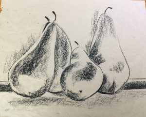
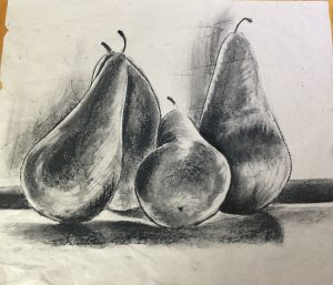
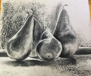
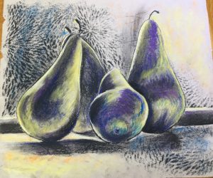
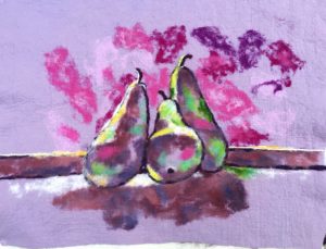
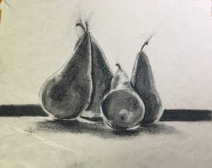
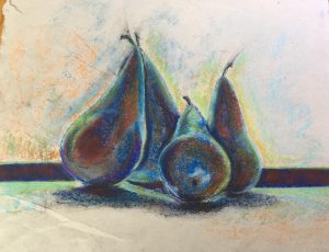
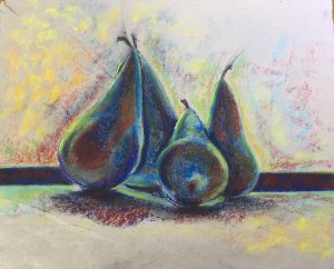
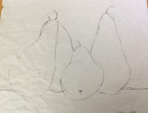
This is my interpretation of the exercises from chapter 1…. Dawn provides a detailed still life photo to work from by I preferred a black and white photo of some pears on a window sill that she provided for an exercise later in the book.

Line:

Shape:

Value:

Texture:

Colour:

Translating this into textiles…

Working with pastels and charcoal is all very lovely but I was itching to put this into practice with felt.

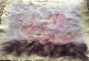
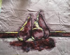
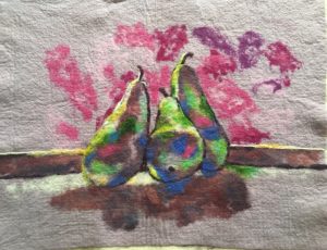
I “cheated” and use some commercial prefelts as a support for my painting with a few wisps of wool between 2 prefelts. Bearing in mind that these fibres will migrate as the felt is fulled I laid out an “underpainting” of tones roughly where I wanted lights and darks to come through between the two layers of prefelt. These fibres will also help the two commercial prefelts glue together

Line

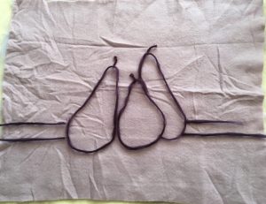
I laid out some purple fibres to suggest the outlines of the pears and windowsill, I used wool tops rolled between my hands with some wool yarns for different line weights and some variety.


Adding white highlights:

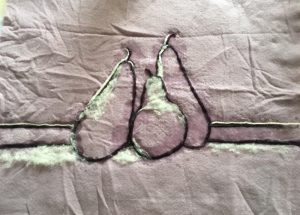
Using yarn and Kap merino.

Adding shadows:

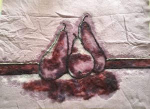
I used some low-immersion dyed Kap merino provide some extra depth but you could also blend 2 or 3 different colours / shades to get the same effect.

Adding a light complimentary colour

The compliment of purple / mauve is yellow… unfortunately the only yellow I have is quite a dark, orangey yellow, not ideal but blended with some white, it will have to do.

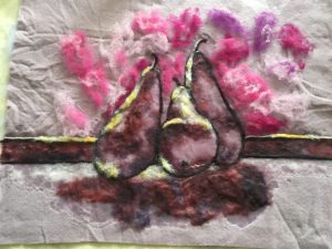
Adding some interest to the background:

Looking at the photo, there’s still something missing….

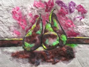
I think it is green! Green and purple, always a good combination in my mind, and the reddish pinks in the background really throw the greens (their complement) forward, although I am running the risk of ending up with khaki brown once the picture is fulled.


Then I brought touches of the bright pink from the background and used it for mid tone highlights on the pears to try to visually link it all together.

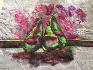
Once it reached the firm prefelt stage (fibres holding together but no shrinkage) I let it dry out so I could assess the colour and needlefelt in some details this is dried prefelt. Wetting the fibres reduces the contrast between the light and dark colours so it is best to let your painting dry out before fulling:

And after adding some more details and dark blue shadows:

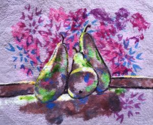
To mimic the texture element from the first exercise I screen-printed some blue and purple patterns over the background and a small area of the foreground before fulling it ready to be stretched over a frame:


My tips for wool paintings:

  • Layout your wool directly onto your felting set up, trying to move it once you have starting arranging the fibres could lead to disaster. I like to work on a sheet of plastic over a bamboo mat as the mat gives to wool some extra support, especially in the early stages of felting
  • Use only enough soapy water to anchor each layer of fibres down, it it is too wet it will be difficult to place the next layer of fibres where you want them
  • Check and rearrange your fibres as necessary every time you add water
  • Kap merino is very versatile for wool painting, the short fibres make it very easy to blend and feather the edges of a colour, it is available from Woolknoll in Germany
  • Spend at least 10 minutes gently massaging the front of your painting to ensure the surface fibres are knitting together before flipping it over and checking the back is evenly wet before starting to roll.
  • Roll up your work, at least to begin with, with the painting facing down, this will minimise the folds and distortion forming in the face (the outside of the roll is slightly stretched while the inside of the roll is slightly compressed when it is rolled up).


Chapter 2 covers various monoprinting, stencilling, embossing and brayer printing techniques, most of which I haven’t tried yet.

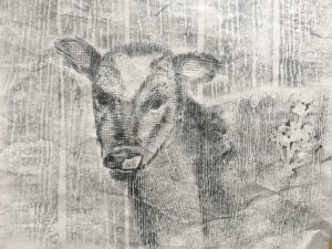
Dawn is clearly a fan of frottage (rubbings), I am sad to say some of the exercises I did for my City and Guilds course put me off this technique but I really like Dawn’s approach. For the most part she seems to use it as an accent in her own work but she also advocated using it to build up an entire image in what she called a “drubbing”. I found this a useful for pushing me away from trying to be to representational and literal in my interpretation and was a lot of fun to boot, this was my attempt at a “drubbing” of a calf using various textured wallpaper samples and charcoal:


Chapter 3 concerns itself with backdrops and under-paintings, among the options presented are, abstracted brayer paintings, watercolour and charcoal value drawings. The exercises at the end of this chapter felt a little disengaged from the chapter content, they predominantly focussed on the effect of different colour combinations but were still very enjoyable and informative in their own right.

Mass drawing with compressed charcoal:


Monochrome:

Complementary colours:


Adding analogous colours:


Towards the back of the book there are more mono-printing techniques, how to take a print from a pastel drawing and how to paint with pastels by mixing with a painting medium and using as paint. I confess I simply haven’t had time to work through those exercises yet but am really looking forward to having a play with them.

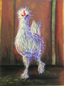
I was particularly smitten with a photo of a fancy chicken that Dawn shared to illustrate the inspiration behind one of her paintings, he was so funny I just couldn’t resist… 🙂

I can see him as a wool painting with his feathers made from coloured yarns and perhaps the occasional wool lock but that will have to wait for a later post….

Adventurous Drawing and Colour with Mark Cazalet

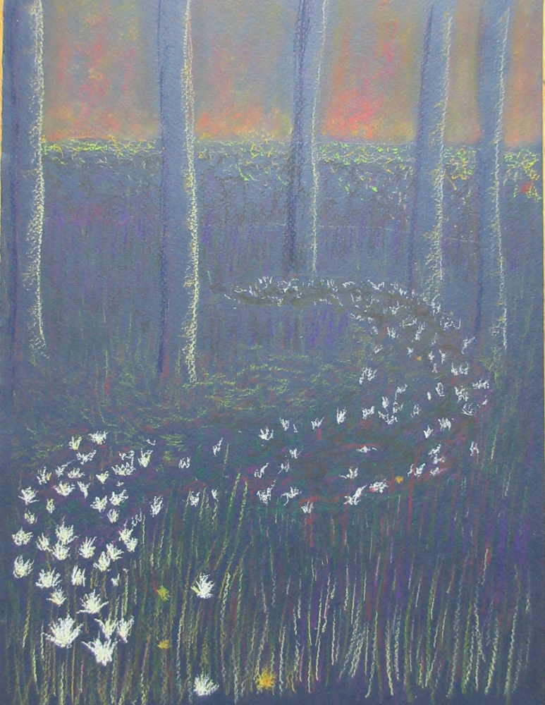
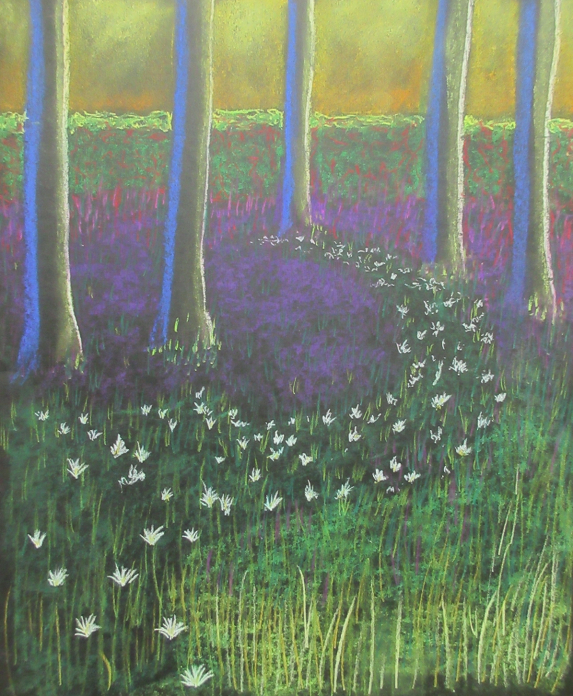
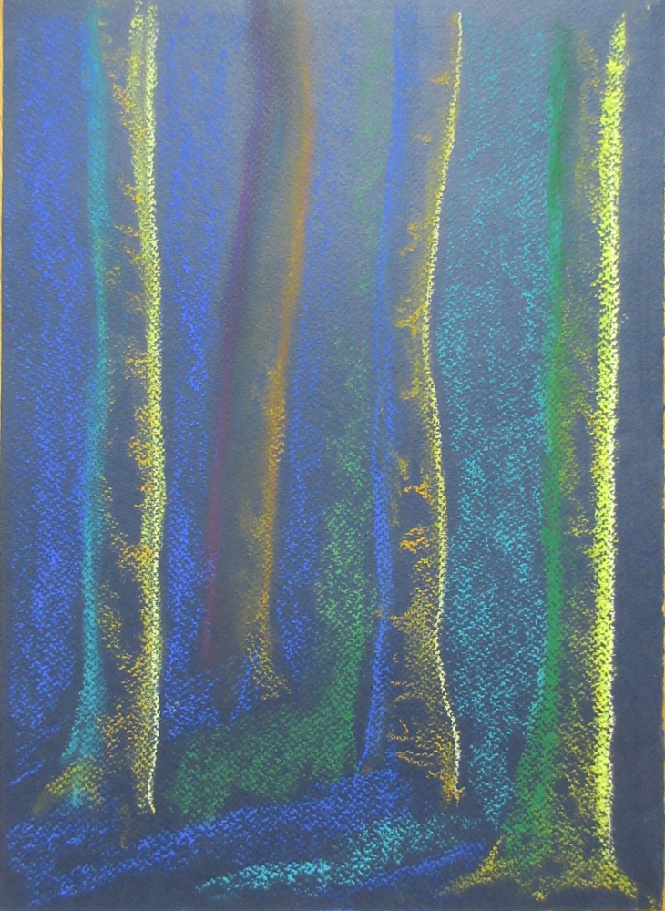
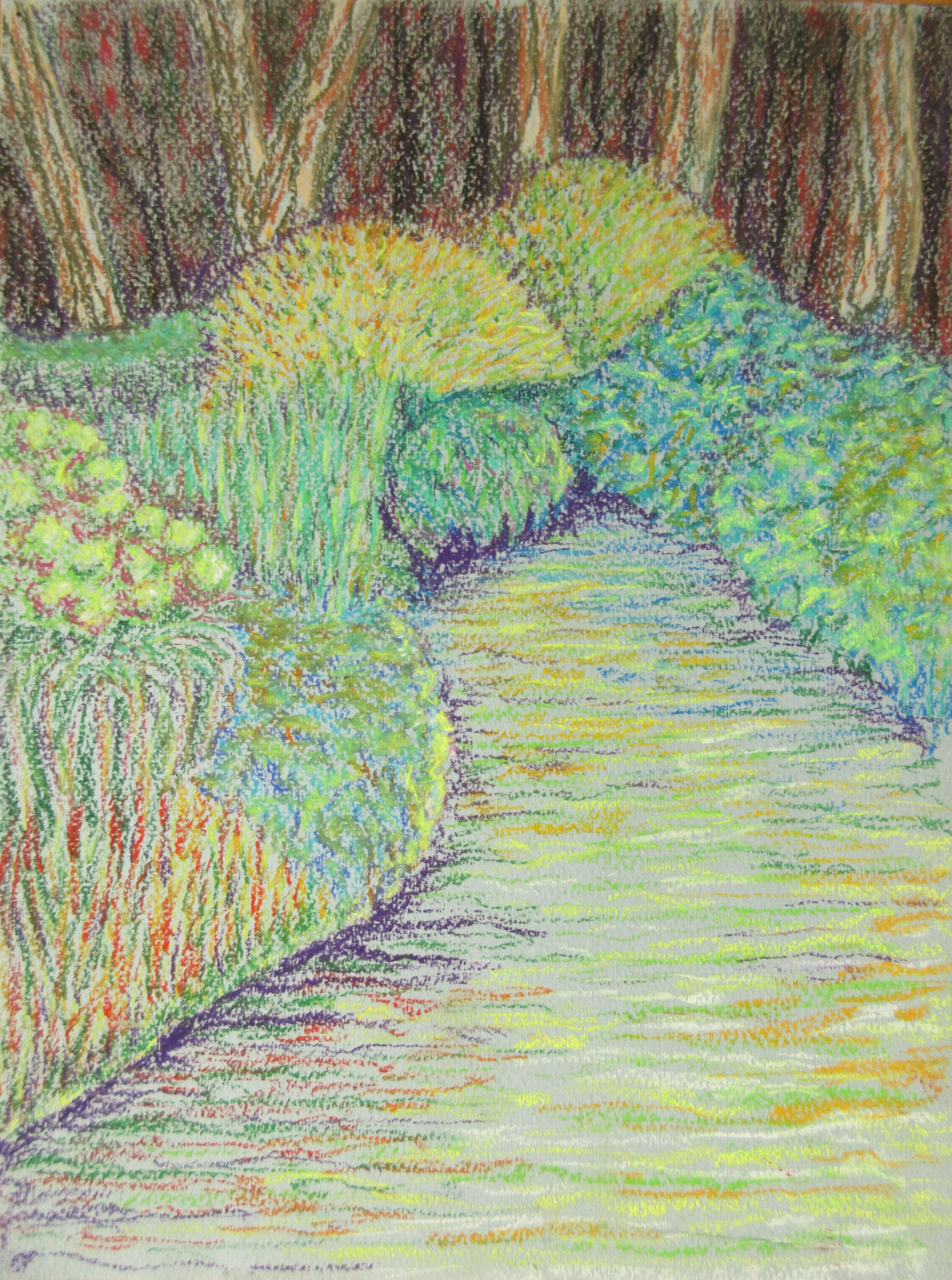
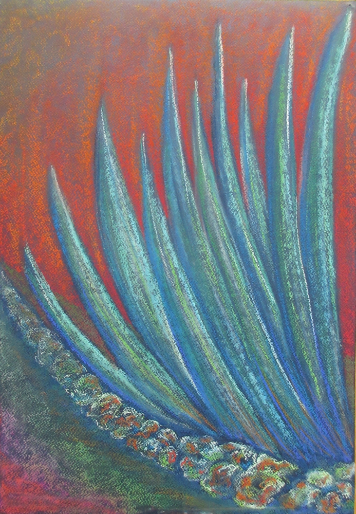
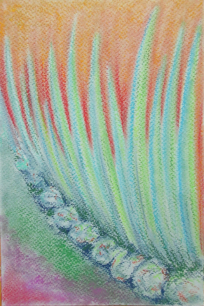
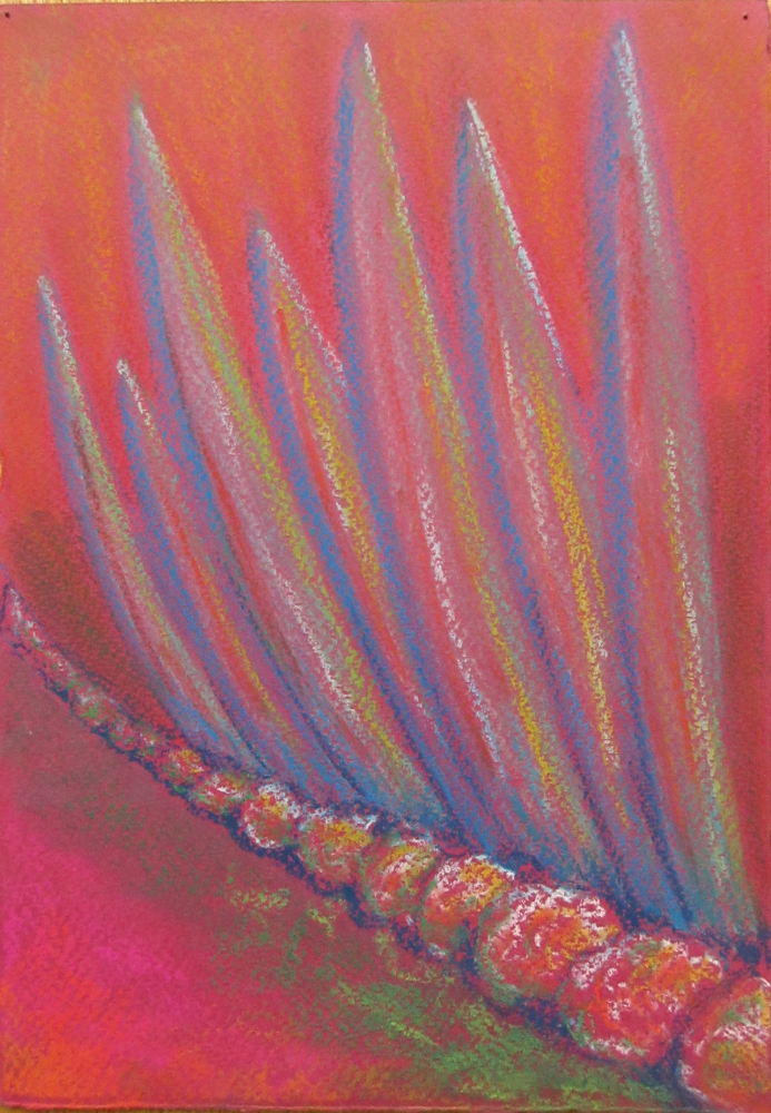
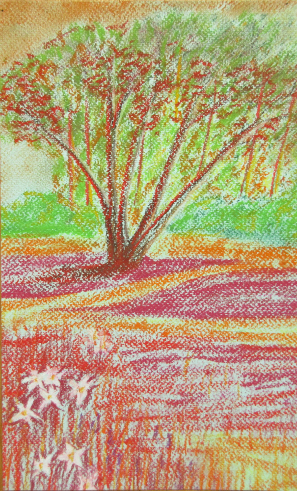
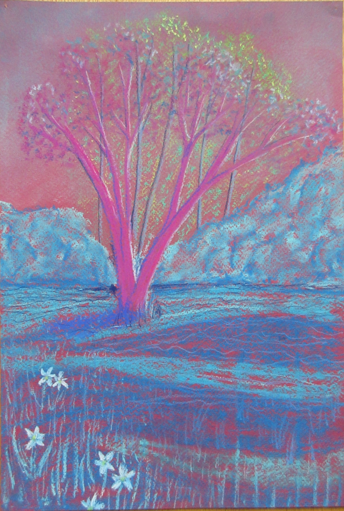
I feel blessed to have spent the bank holiday weekend drawing in the beautiful landscapes around West Dean in  glorious sunshine. Mark Cazalet was an excellent tutor, I signed up for this course hoping to come away using colour in a more considered way and he did not disappoint. He set us a number of exercises over the 3 days including using cool colours on warm grounds (papers) and vice versa, exploring the effects of black versus cream grounds and seeing the colours around us in a much less literal way.

The first drawing was made in the gardens, Mark suggested I redraw it from my original drawing without looking at the source.


It is interesting how the colours are so much more vibrant…


This one was a 10 minute sketch, playing with different colours to give and impression of depth, light and shade:


This drawing was exploring the combination of warm and cool colours together on a neutral ground:


I had 10 minutes before we were expected to pack up and return to the studio so I did this one just for fun:

We were asked to create some sketches of abstract forms  from what we saw in the gardens, from those I repeated the same design several times on different coloured grounds, it is curious how the colour of the paper has such a an impact on the feel and tone of the drawing.


These last two drawings are my least favourite but it was an interesting exercise, the first was warm colours on a cool ground:

And cool colours on a warm ground:


Now it is back to work for me! Enrolment for the new online felted bag class closes on the 22nd and the class starts in earnest on the 25th, I am still doing the final edits on the tutorials while trying to prepare for the Surrey Open Studios event beginning on June 2nd it is going to be a busy few weeks but both are projects I am really excited to be taking part in, if you would like to join in the fun please follow these links:

Felted bags online class: link

Surrey Open Studios: link


Drawing with 5 (6) Tutors

The end of November saw the second module of my FDAD course at West Dean College, this time it was drawing with 5 tutors but being a sucker for punishment I also tagged a FDAD drawing day onto the start. The drawing days are all about exploring creativity and generally seem to involve a large still life and a series of exercises. Our still life was a set of 5 manikins covered in printed and torn /crumpled pieces of paper.

I tried drawing the manikins, really I did! 🙂 But kept being drawn back to a couple of pieces of crumpled up paper with a black and white stripey print. I most liked the collage pieces I made from looking at those:


I think some of these have potential for interpretation in felt, I was sorting through my bag of felted off-cuts today and thinking some could be used for this…

Drawing with a different tutor each day turned out to be quite challenging, largely because they all disagreed on the best approach. It felt like we were continually unlearning what we had discovered the previous day! That said, it was great to be exposed to so many differing points of view 🙂

Day 1 of the course was Accuracy and Observation with Andrew Fitchet. Andrew provided some useful techniques for planning out where each element will sit on the page and maintaining scale and proportion but I confess I found his delicate, controlled approach quite hard work, I was quite relieved when we were encouraged to use charcoal instead of pencil:

experimenting with different blending / shading techniques

In the afternoon we decamped to the house to look at perspective (I think Andrew may have wandered into Maxine’s territory here) and then back to the studio for another still life:


Day 2 was spent with John T Freeman, for life drawing. While I gathered useful information and tips from all the tutors, I think this was the session that I have used most so far. John taught us his approach to figure drawing, to him drawing should be like writing and his method for drawing figures has really loosened up my approach to life drawing and made it possible to sketch figures very quickly or from imagination, something I really struggled with before.

Initially he had us sketching sportsmen in unusual poses from the sports section of a newspaper:

Then we had a life model to draw from:

Since the day with John I have been sketching dancing figures from imagination:

Day 3 was led by Maxine Relton, she taught scale and perspective, there was quite a lot of theory and not so much drawing on this day:

Day 4 was spent with Veronique Maria, “drawing with the senses” this was a somewhat New-Age blend of mindfulness, drawing and sculpting with your eyes closed,  and drawing to music. While I enjoy drawing to music I’m not sure drawing blindfolded was all that helpful, I’m sure a toddler with a pack of crayons could produce something more interesting to look at. They were such a dreadful mess I’m not going to post them here.

This piece was drawn to music in near darkness and was inspired by a glimpse into a box of squash just before we started:

This is one of the squash I drew for fun in between taught sessions:

This next piece involved drawing an object you could not see but only feel (it was hidden in a bag that you put your hand into), this was interesting and I enjoyed it. The object turned out to be a shell and here it is drawn “blind” from several different angles:

Day 5 was with Freya Pocklington, drawing from imagination, this was the shortest of the days but we packed a lot in, covering some approaches to surrealism and charcoal reduction. One of the first exercises she gave us was to create a drawing in less than 10 min that encompasses the words; storm, room, jealous and dancer. Looking at this now I realise “room” could have been interpreted as space to move.

Charcoal reduction, drawn from a stuffed head in the main house:

Finally, applying some principles of surrealism to objects found in the house:

Scale: Cats teeth witnessed through and open door / Texture: fur on an eyeball

Parts: Piano keys replaced with cat paws / Place: diving bell on a can-can dancer

All in all, a very good but thoroughly exhausting week. I would definitely recommend it to anyone who wants to expand their drawing skills and the good news is you don’t need to be a FDAD student to attend the West Dean short courses.

I probably will not be able to post next week but hope you all have a wonderful holiday season and find some time to be creative in between tending to your families’ needs.

A New Direction

I have been considering my developmental options since I completed a City and Guilds certificate in felt-making in 2014, very high on my list is a BA degree but it is a big commitment both in time and money. I am very fortunate to live only a few miles from the University of Creative Arts in Farnham so went along to an open day on a reconnaissance mission.

It was quite an eye opener, I hadn’t really considered the need for a portfolio or how my sketchbooks appear to anyone else. I have a tendency to work out my designs and ideas directly in wool, my sketchbooks are primarily used to work out template designs or jot down ideas for future projects, they read more like a technical manual than an artists sketchbook 🙂

That was a couple of weeks ago and I decided to continue with the “stories of the trees” brief that Fiona Duthie set last year, with my main focus being on bark. It is still very early days but my sketchbook is already looking much more colourful!


I treated myself to some inktense blocks (they work on fabric too), these are my first couple of “getting to know you” pieces working with them and already think they are wonderful!


Lest We Forget

I am feeling very chuffed, one of the pieces I submitted to the Weavers, Spinners and Dyers National Exhibiton has been accepted. Fancy that, a feltmaker being accepted to a juried show of weaving and dyeing!

I have been itching to share this piece with you for several weeks but couldn’t in case one of the jurors saw it.

This piece was inspired from a combination of some sketches I made of poppy seed pods from the garden and the realisation that 2014 is the centenary of the start of World War I.

They all cried out a very obvious vase shape to me:

Initially I planned to make this vase using a resist method but then I had a brainwave and thought of a way to interpret my willow weaving skills into felt and after a small test piece, created “Lest We Forget”. The vase shape was woven from cords of white merino and then dyed with acid dyes.

This is the work in progress:

The red and black colours were chosen as the traditional colours of the poppy flower but they also represent the unnecessary blood shed and millions of deaths that occurred not only during WWI but in countless wars since.

If you would like to see this piece in person, it will be on display at “Yarns in the Cathedral” in the Hostry of Norwich Cathedral from 15 May to 1 June 2014.

Linking up to nina-marie

Gestural drawing

For my C&G course we have been asked to explore gestural marks and drawings using Da Vinci’s “Deluge” as inspiration. To be honest I have enjoyed this far more than I thought I would when I first read through the module, at first I was a disappointed to not be making felt of some sort but I found the quick, uninhibited way of making marks on paper quite liberating (in the end).

This is da Vinci’s Deluge that I was instructed to use as a reference.

I have always found working from another artist’s work somewhat daunting, trying to reproduce someone else’s work usually results in disappointment that what I have produced is inferior in some way. I much prefer to take inspiration from other’s work and interpret it in my own way.

So I sat in front of “the Deluge” pondering how to approach it, making a few scribbles and doodles that loosely represented parts of the great work. Then I tried making a charcoal drawing. It wasn’t working.

It was time to go back to basics, I felt I needed to look at some real-life clouds instead of da Vinci’s interpretation and lucky for me I was in the “land of the long white cloud”, and we found ourselves driving towards gathering thunderclouds the next day so I took lots of photos and produced a couple of sketches.

Feeling more confident about cloud shapes and how light and shade create the illusion of lines and shape I took another look at the Deluge and produced this piece surprisingly quickly; less than an hour ignoring the time it took to dry after the wash. I’m really pleased with how it turned out.