Category Archives: fabric painting

Sun Dyeing

I was reading a blog a couple of weeks ago with some scepticism. With the benefit of hindsight I concede my scepticism was a little unfair. The blogger in question had posted about sun dyeing and said that you don’t need to buy those expensive photo-sensitive fabric dyes / paints, any old fabric paint will do. My initial reaction was, if any old fabric paint will do why is there a market for those expensive photo-sensitive paints? Too good to be true right?

The scientist in me made me set my scepticism to one side long enough to perform a little experiment. We all want to save our pennies to spend on more textile toys don’t we??

Materials:

  • Light coloured cotton based fabric (I expect silk will work too but synthetics possibly not – those are experiments for another day 🙂 )
  • A pad of newspaper or a large box (I used a plastic under-bed storage box)
  • Masking tape
  • A spray bottle filled with water
  • Fabric paints (I used Setasilk (iron-fix) silk paint and acrylic paint mixed 50:50 with textile medium). If you don’t plan to wash your fabric you can replace the textile medium with water.
  • Large brushes (I used the foam type)
  • Resists – I used leaves but anything that will lie flat on the fabric and block the light all work well. Paper cut outs and opaque stencils work well.

This is what I did:

  • Stretch your fabric over a box or a pad of newspaper with masking tape
  • Spray with water until evenly wet, allow the water to disperse while you gather some leaves or other objects to create a resist.
  • Working quickly, cover your fabric with fabric paint and lay out your resists, ensure they are as flat as possible to the surface of the fabric.
  • Leave in a sunny spot for 2 hours (beware of breezes blowing all your resists away if you put your box outside – I left mine in front of a south facing window).
  • The hardest part is resisting the urge to lift the leaves to see what is happening underneath 😉
  • Remove the leaves / resists and iron for several minutes to heat fix.

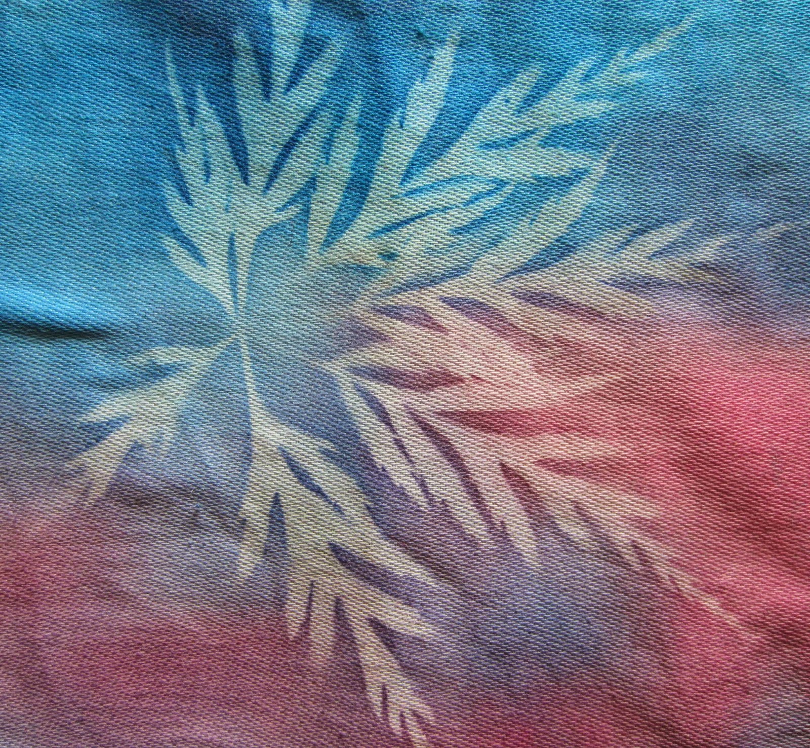
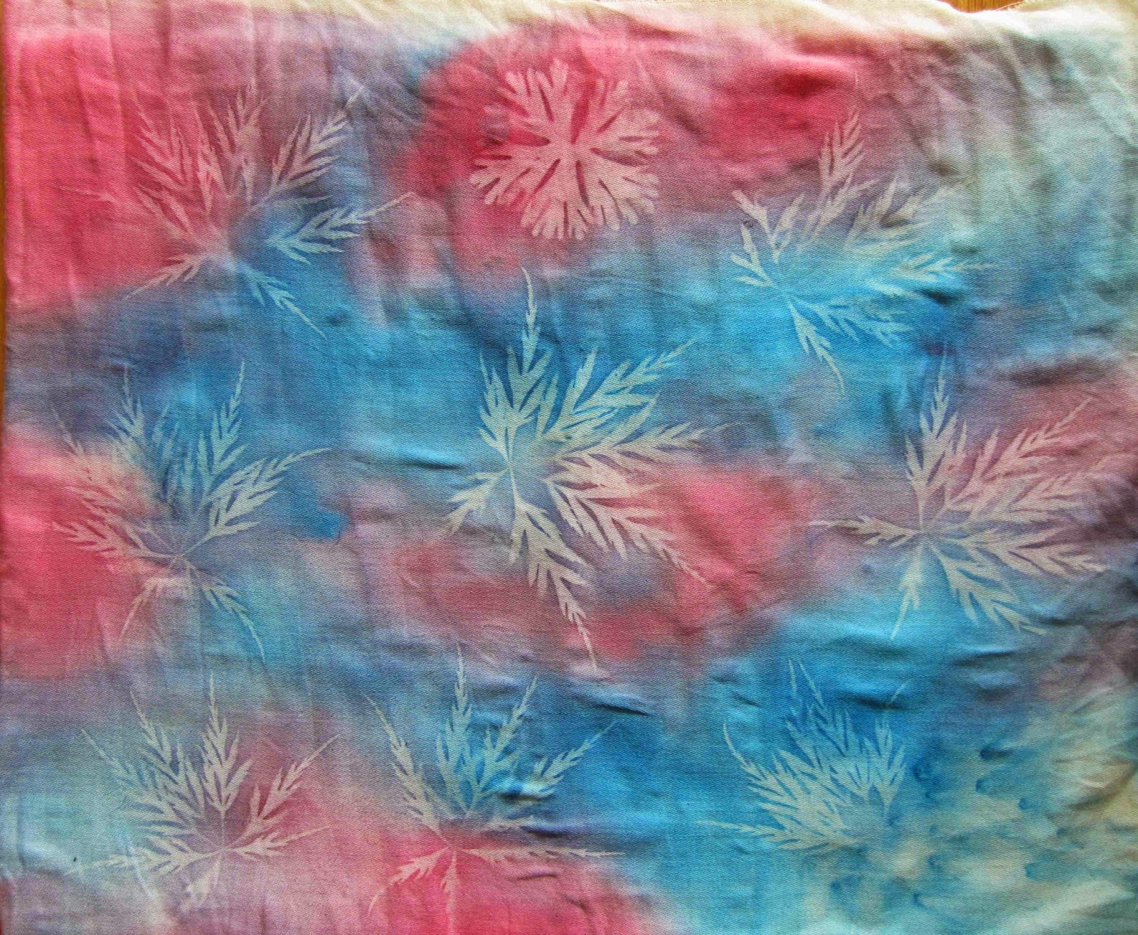
Sitting in the sun catching some rays, the pink and blue on the left is the Setasilk paint and on the right is red acrylic paint mixed with textile medium.

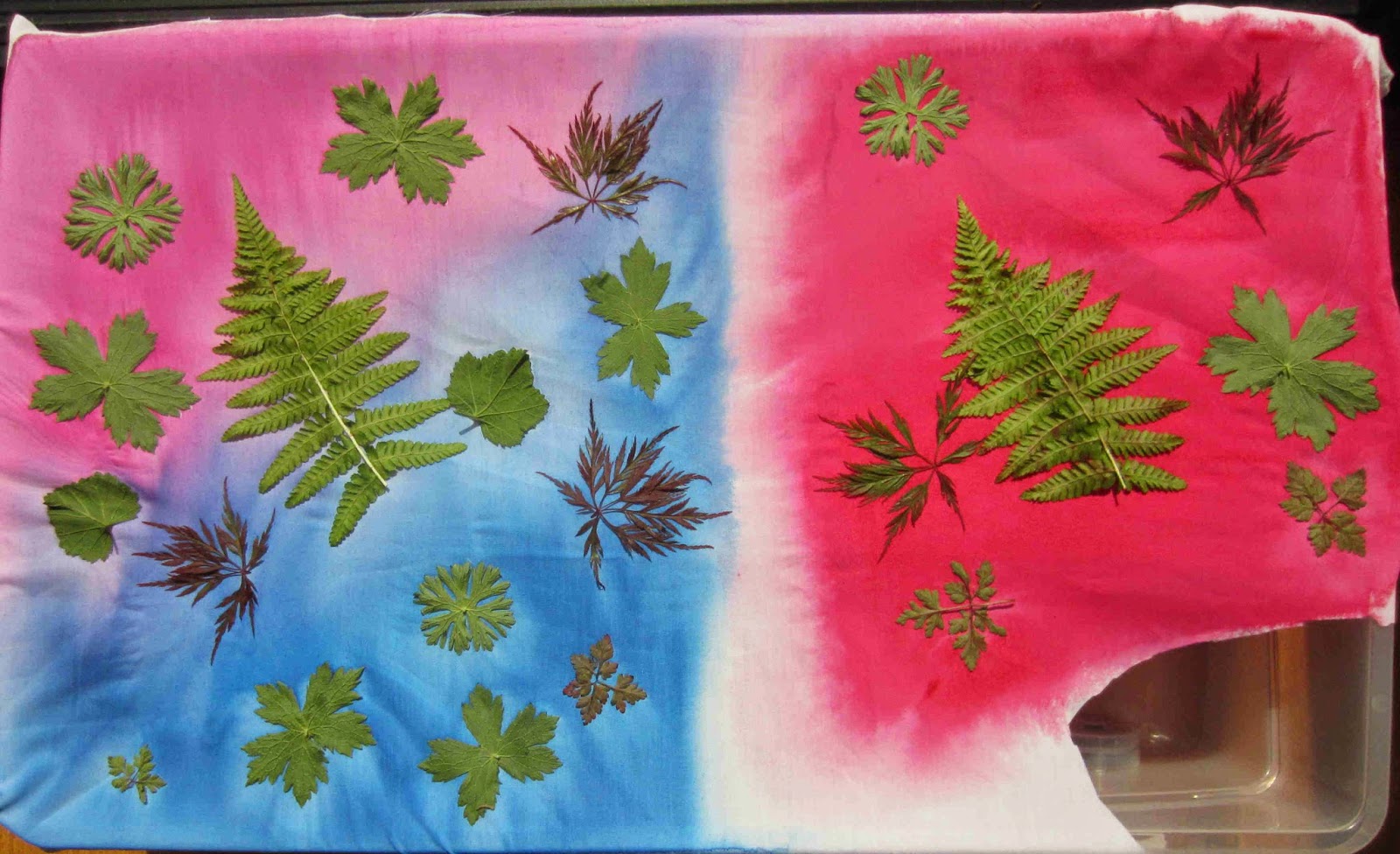
I think I applied the acrylic paint (on the right) too thickly, hence the effect is not so noticeable. In the areas where the paint is a little thinner the leaves are paler.

A second attempt with a lighter coating of acrylic paint. I also sprinkled a few grains of rock salt in the bottom right to see what effect that would have:

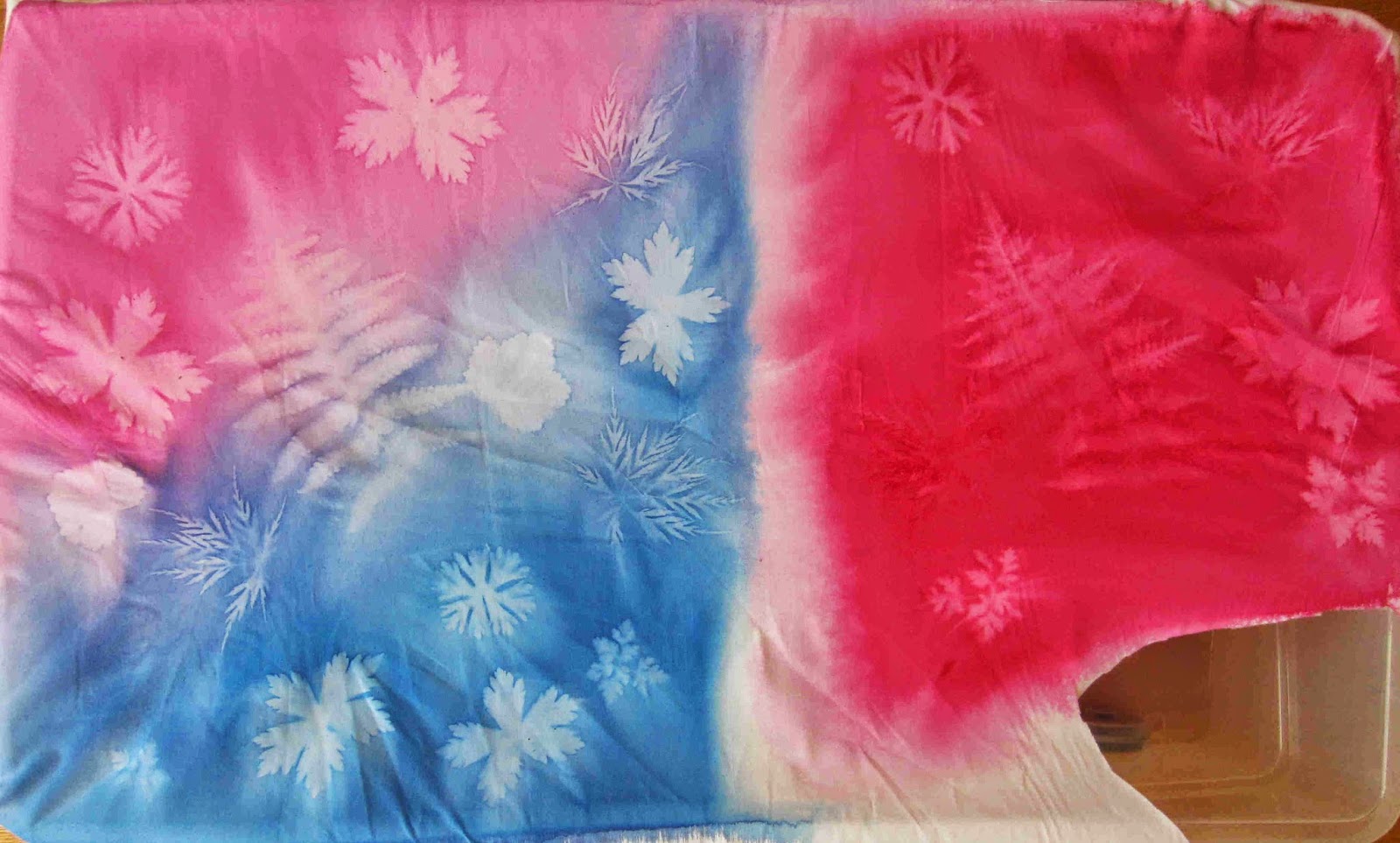
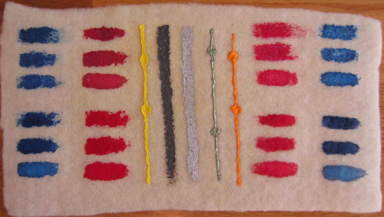
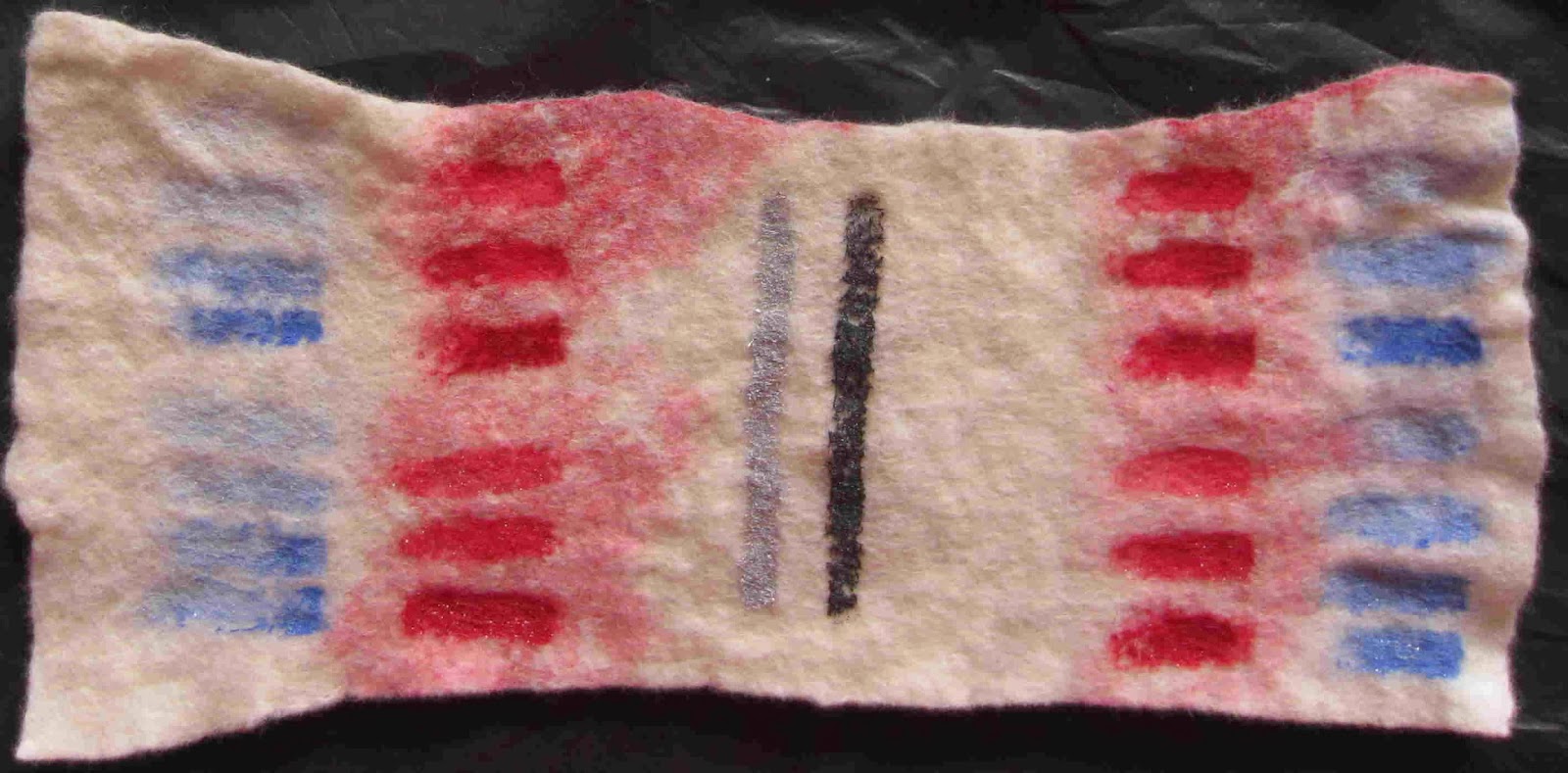
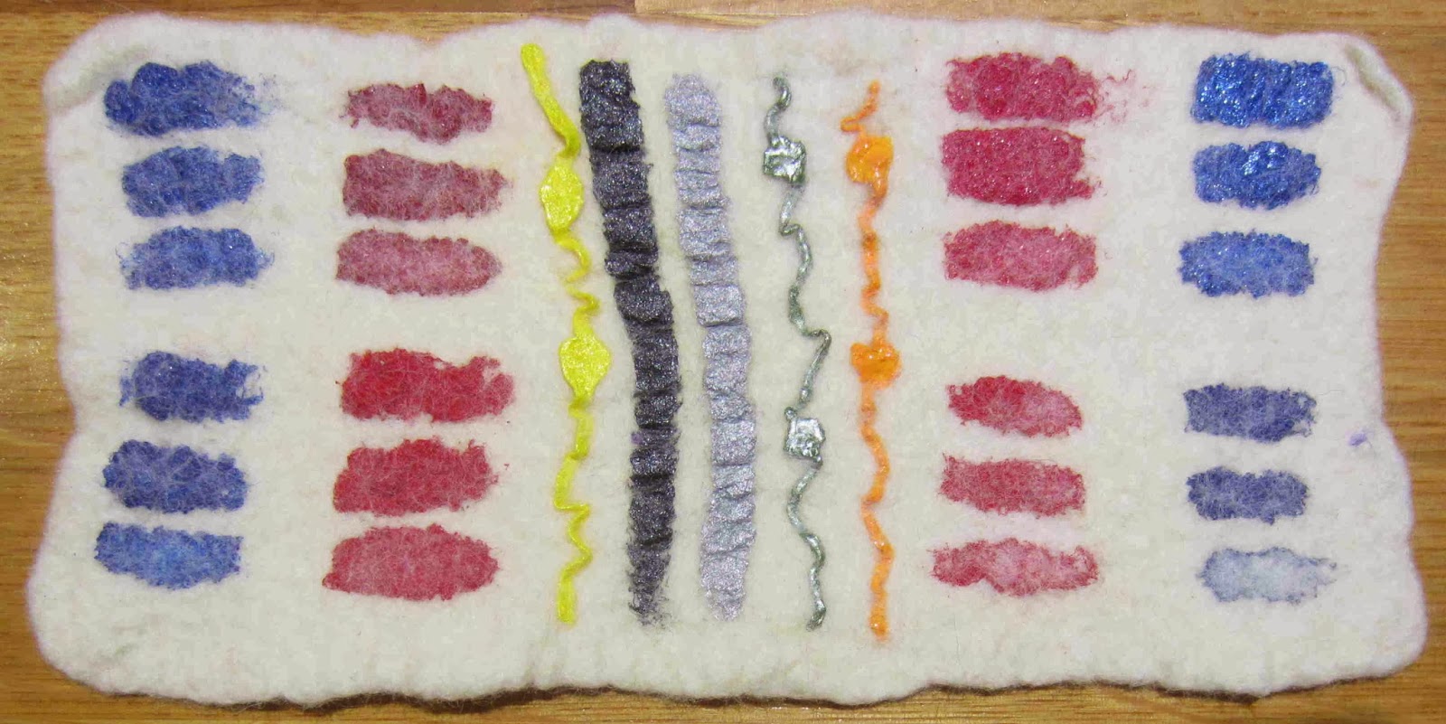
After 2 hours on a sunny windowsill:

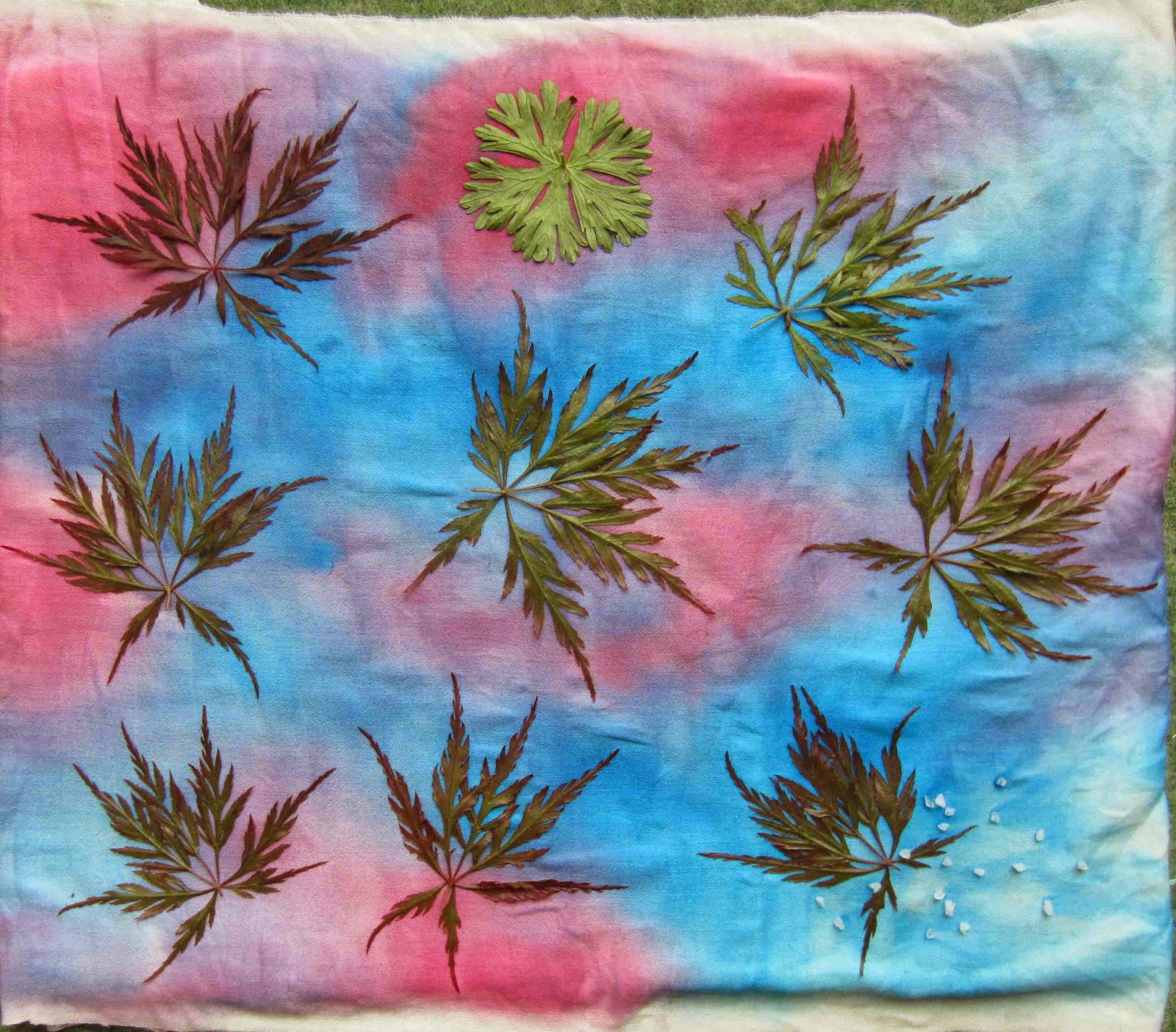
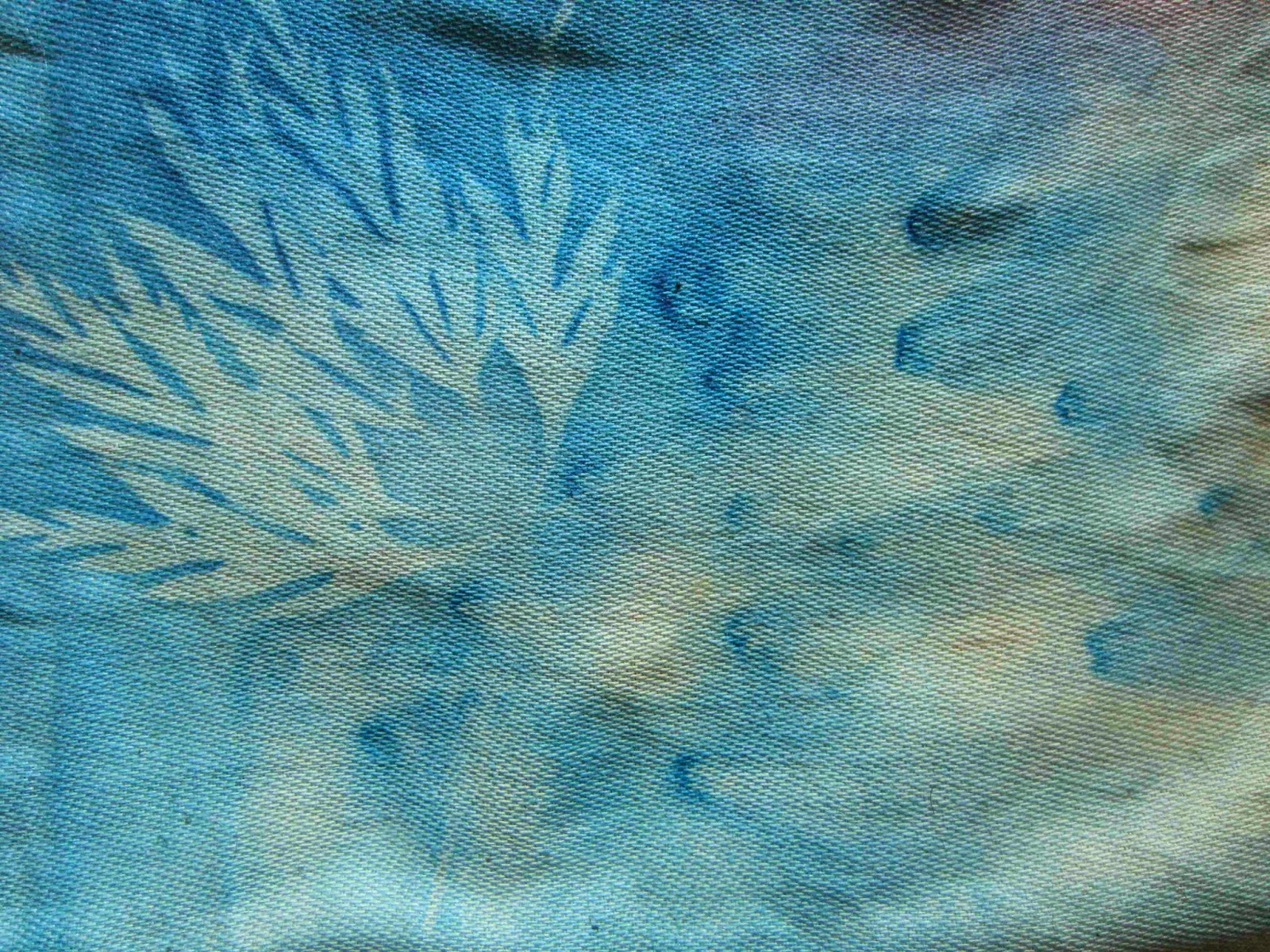
Close up of the salt effect, it appears to have concentrated the paint under the grain and drawn the paint from the surrounding area:

A close up of an acer leaf outline.

Have you done any sun dyeing? What paints / fabrics did you use?
Linking up to nina-marieoff the wall Friday

Using acrylic paint on prefelt – the results

As I mentioned in an earlier post I have been experimenting with acrylic paint on prefelt. These are the results of my experiments….

This is what the paints looked like on the prefelt after ironing but before felting:

The effect of wetting out the prefelt before painting
Painting on damp felt saw the paint soak through the felt so that more of it ended up on the newspaper behind than on the felt itself. As it dried it also wicked across the felt. This might be useful for blending colours for a background but would be too unpredictable for most forms of painting. The wicking was most obvious with the red paint:

Thick vs thin paint
During felting more fibre migrated through the thin paint than the thick, producing a slightly paler colour in the thinner paints.

This is the sample after wet felting:

The thickest paint is uppermost in each block of 3 stripes, the thinnest paint is the bottom stripe of each block of 3.

Iridescent medium added to the paint
These are the top 3 bars in each column. This worked remarkably well and the sparkly flecks are particularly effective in the thicker blue paint

Addition of textile medium
These are the blue and red bars on the left, it has clearly made a big difference, especially the paint without the iridescent medium added (lower 3 bars in each column). The thinner paints have largely washed away during felting. It looks as though the iridescent medium has a similar protective quality to the textile medium.

Commercial fabric paints
All the commercial fabric paints have rippled during felting, however, the Deka permanent black and Silkcraft metallic silver have a flatter, more flexible finish than the Pebeo commercial paints.

Forgetting to iron fix before felting
As I mentioned in an earlier post, it appears that iron fixing is essential if the piece will get wet, without it the paint washed out during felting (or washing), even when textile medium was added. This was the result of felting without ironing first, the top sample was dry when painted, the bottom sample was damp:

Final thought
Having looked at how the fibres have migrated through the paint during felting I think this technique is best reserved for use after fulling / milling, although the rippling in the commercial fabric paints is rather appealing.

Have you used acrylic paint on felt or fabrics? Please feel free to post a link to your work in the comments section.

Numpty

I am kicking myself, I’m afraid I made a boob with the acrylic paint tests; after patiently waiting for them both to dry I completely forgot to iron them before I started felting. I am such a numpty :o(

The experiment was going well and I did discover that painting on wetted prefelt results in the paint wicking (bleeding) away from where you put it. And I confirmed that if you don’t iron the paint before washing, it WILL wash out.

This is the paint while it is still drying:

Once dry and before I messed up, you can clearly see how the red paint has “bled” in the lower sample:

After felting, the bars on the left of each piece are acrylic paint mixed with textile medium and it does appear to have protected them from my stupidity to some extent:

Back to the drawing (painting) board….

Fabric Dyeing

This has been another fun weekend, I always enjoy dyeing fabric and yesterday I did some more shibori exploration in preparation for a monthly craft group at the end of January. We will be playing with shibori techniques and as the only one who has practiced any shibori at all, I expect it will fall to me to “teach” everyone else. I feel like a bit of a fraud since I have only done it a handful of times before. These are the fruits of my efforts, they are all small samples but I am quite pleased with how they turned out.

Clamped with triangular shaped pieces of wood:

Clamped with square pieces of wood:

Twisted and wrapped around a ruler:

Pleated, twisted and bound with elastic bands:

I also did some rainbow dyeing on ponge silk:

Cotton muslin:

And cotton scrim:

First Quarter Challenge 2014

The lovely ladies at Felting Fibre Studio have set another fab quarterly challenge, this time it is to interpret Jackson Pollock’s work into fibre. I confess I’m not a big fan of most abstract art but some of his more colourful pieces do intrigue me. Looking through images of his work, the following caught my attention the most:

I like the radial symmetry of this piece and think the white dotted lines might do well with some batik style dyeing.

I’m not so keen on the aesthetics of this piece but I like the concept of twisted ropes of felt and other fibres, this piece definitely lends itself towards interpretation in fibres… it reminds me of my attempts at knitting!

At the time the challenge was set I was working on some batik pieces and this seemed like an obvious place to start, effectively throwing the liquid wax at the cloth a la Pollock style and then dyeing and painting over the top of that. This is the first step towards that piece…

I am also hatching another idea I had was sparked by Annie’s birds at Rosiepink, she uses acrylic paint on felt after sketching with machine embroidery. More on that another time.

Fabric Painting

I have had a brilliant couple of days creating batik style fabrics based on my cloud drawings for my City and Guilds course. I could do these all week :o)

This one is pongee silk using silk paints and gutta:

Same silk and paints but this time using the liquid wax, I think you can see the resist lines are thicker. They turned yellow when ironing the silk to fix the paint, I hope they will return to white when washed.

Liquid wax and procion dyes on silk and silk chiffon. The dyes on silk are much more pastel in colour than the same dyes on cotton.

Liquid wax on cotton muslin with procion dyes, these are my favourites, the colours are just so vibrant and juicy!

Never one to be content with just following the brief I conducted some experiments of my own too. Using the monoprinted fabric I was least enamoured with I gave it the “painting with dye” treatment and once that had dryed played with some other “toys” in my play box of fabric paints too; some 3D paint in shimmery white and bronze and some blue glitter paint for fabric. I’m still waiting for these to dry before I can “puff up” the 3D paint and wash it.

This is what it looked like before I started playing:

And after:

This is a close up showing the glitter paint near the bottom of the frame.

I think this piece is much improved from the addition of a bit (ok, a lot) of colour, only time will tell if the 3D and glitter paints will tolerate felting….

monoprinting

Following on from the cloud sketches we were asked to use them as inspiration for monoprinting, these are my efforts using acrylic paint on various papers. We were limited to using just black, white and brown paint but I think I may have cheated by using coloured papers for some of them.

The first one was produced by just squeezing paint from the tube onto the acetate so perhaps not too surprising that it is mostly “blobby” where the thickly applied paint has spread.

All the others were made with a paint brush, with a few blobs where I was a bit heavy-handed with the paint.
The next 2 are my favourites out of the initial set on copy paper, the first one has a lot of energy and movement about it that I find exciting, the second reminds me of Japanese characters and the repetition of the shapes is quite calming.

This one reminds me of looking at reflections in water ripples…

Using my 2 favourite monoprints above I explored the effects of different papers, this one is textured pastel paper and stamped over the top with a shape I cut from a cleaning sponge.
Blue card
Some handmade paper with rose petals, I love the mottled effect of this one. I think it is my favourite.

Some marbled paper, the paper looked like clouds on a blue sky so seemed rather appropriate
Textured red card
Then I took the same designs onto fabric.

Having liked the monoprints on mottled / coloured papers so much I rummaged through my stash to find some rainbow dyed cottons. I really like how these turned out, much more exciting than the white background.

Once fixed, I plan to felt these fabrics.