This week I have been a good girl (mostly) trying to catch up on my City and Guilds work, there’s been some dyeing of wools and animal fibres and using natural fibre colours. It’s very easy to overlook all the lovely browns, creams and greys that wool naturally comes in when confronted by the vast array of juicy, commercially dyed wools that are so readily available but I hope I can convince you to at least take a second look at the natural colours too….
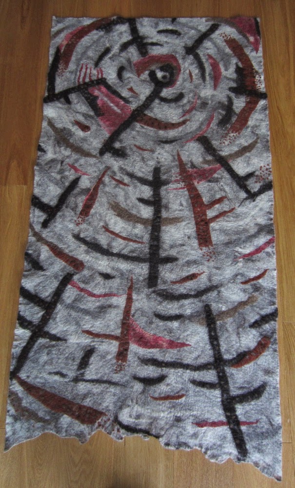
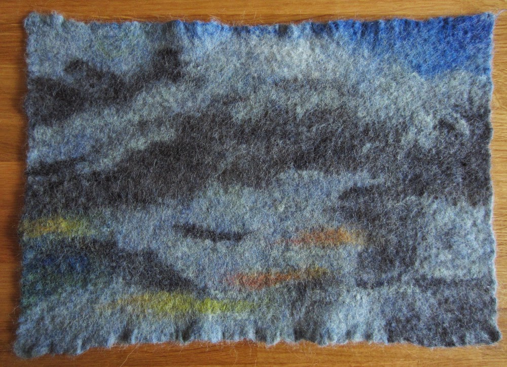
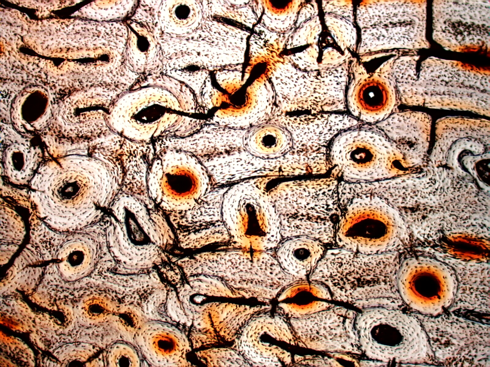
For the current series of C&G assignments I have been using bone micrographs as my starting point and this piece was no exception. I found this photo on the Microlab Gallery and used it for inspiration. This is a piece of fossilised dinosaur bone as seen under the microscope.
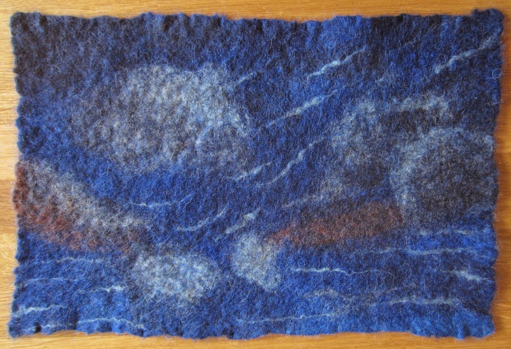
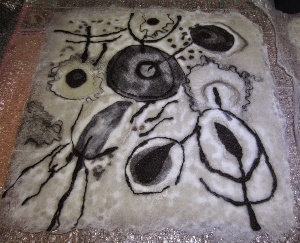
Here are the fibres wetted out ready for rolling, I even used some of my hand-spun Jacob wool for drawing lines (my spinning is still a bit erratic but is getting better and I like the thick and thin effect in this painting).
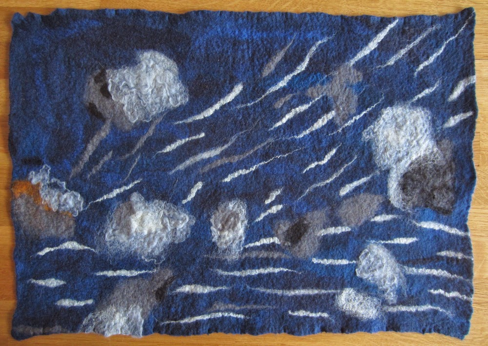
And the finished piece.
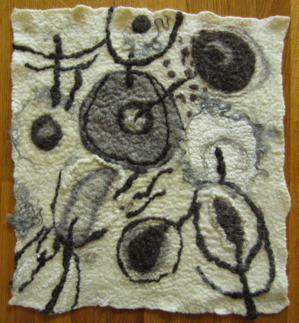
I really like this piece, it is quite heavily textured and I’m finding hard not to stroke it whenever I wander past. I think it looks lonely and needs some companions, so will have to make a few more ;o)
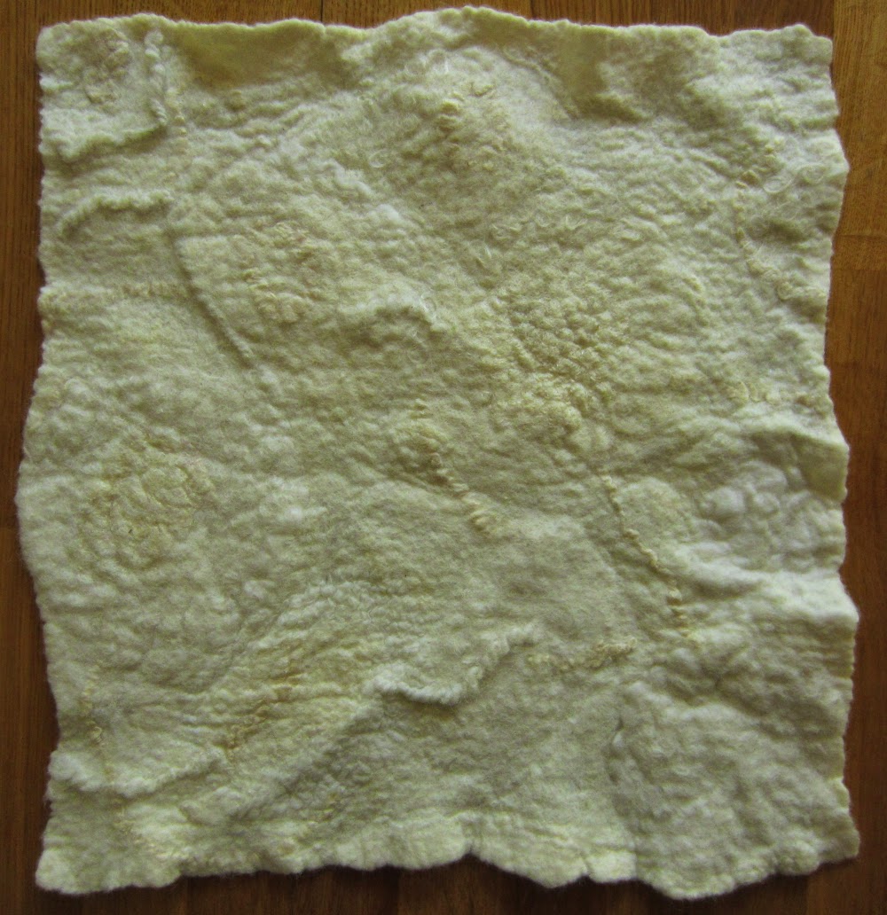
For a related assignment we were also asked to make a piece from just white fibres with the intention of dyeing it so that the different design elements would be revealed as not all fibres accept the dye at the same rate. Here is the piece laid out, ready to be wetted out and rolled:
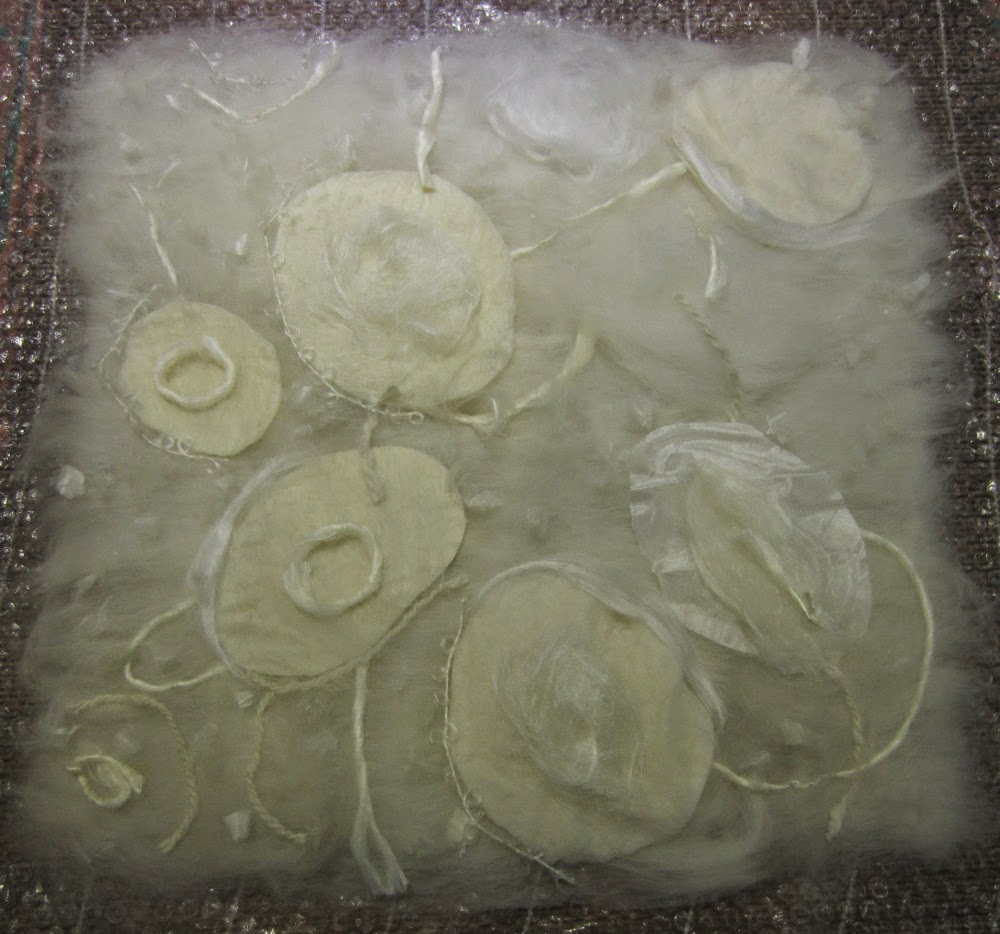
And before dyeing (not very inspiring!):
And after dyeing:

I’m a little disappointed with this piece, I’m glad I incorporated some vegetable fibre (igneo corn top) which does not accept the acid-fast dyes, the corn top is the only element that has provided a reasonable amount of contrast. All the wools, silks, mohair and alpaca seem to have accepted the dye fairly evenly so the changes in colour are rather subtle. The different textures are nice though. I am tempted to add some embroidery to make it more interesting…..